

By Interior Design Desk
Published: September 2026
Main Facts
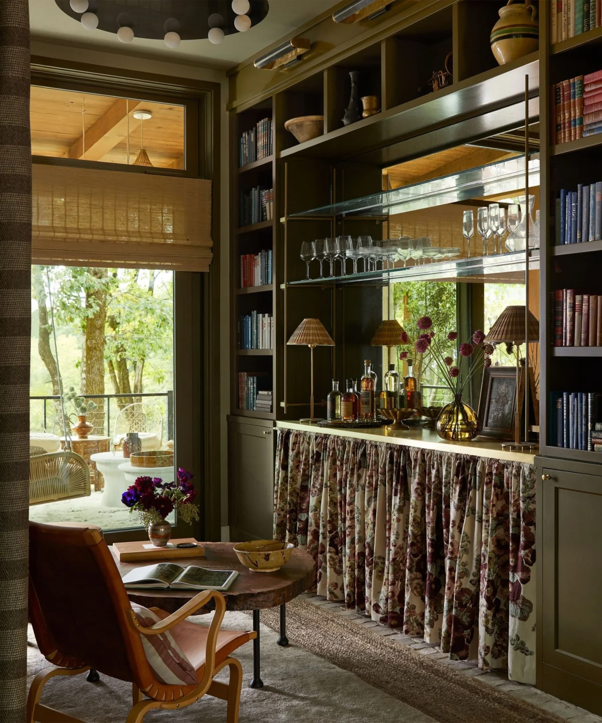
As the calendar turns toward the cooler months, the design world traditionally pivots toward a predictable cycle of heavy, cocooning shades. For decades, the arrival of autumn has signaled an automatic rush toward deep burgundies, burnt oranges, and heavy amber tones designed to insulate living spaces against the fading light. However, luxury paint and wallpaper maker Farrow & Ball is disrupting this long-standing design convention.
With the launch of its newly curated ‘Colors of Autumn’ palette, the heritage brand is proving that seasonal interior design does not need to be restricted to predictable, heavy moods. Instead, the edit juxtaposes rich, organic earthy tones—such as mossy greens and deep browns—with unexpected, cooling shades of blue and vibrant, fiery reds.
Spearheaded by Patrick O’Donnell, Brand Ambassador at Farrow & Ball, the palette captures the nuanced, multi-sensory realities of the season: from wet stones and glistening lichen on boulders to the long, low shadows cast across autumn fields. Rather than relying on clichéd harvest motifs, this year’s palette offers a sophisticated masterclass in balance, pairing grounding neutrals and earthy greens with bright, uplifting hues to create timeless, versatile living spaces.
Chronology of the Trend
The evolution of modern autumn color theory has shifted dramatically over the past several years, moving away from temporary seasonal novelties toward a more holistic, year-round approach to color psychology.
- Early 2020s: Fall interior design was dominated by monochromatic palettes of heavy terracotta, dark chocolate browns, and saturated mustards. While effective at creating physical coziness, these spaces often risked feeling dark or restrictive as natural daylight began to wane.
- Autumn 2025: Design houses began experimenting with a broader range of rich, saturated shades, introducing wine colors and deeper oranges to create dynamic shifts in interior lighting. However, these shades remained largely within the traditional warm spectrum.
- Current Launch (Autumn 2026): Farrow & Ball formally introduced its comprehensive ‘Colors of Autumn’ narrative. By deliberately stepping away from predictable wine tones and stark oranges, the brand championed a more grounded yet multi-dimensional palette. This modern edit incorporates unexpected, contrasting elements—such as powdery blues and denim undertones—proving that seasonal decorating can incorporate lightness and airiness without sacrificing warmth.
Supporting Data & Palette Breakdown
To understand how Farrow & Ball achieves this delicate balance between comfort and vibrancy, one must examine the specific shades driving the 2026 trend. The collection relies on a careful ratio of grounding organic tones, surprising cooling agents, and fiery highlights.
1. The Grounding Greens and Browns
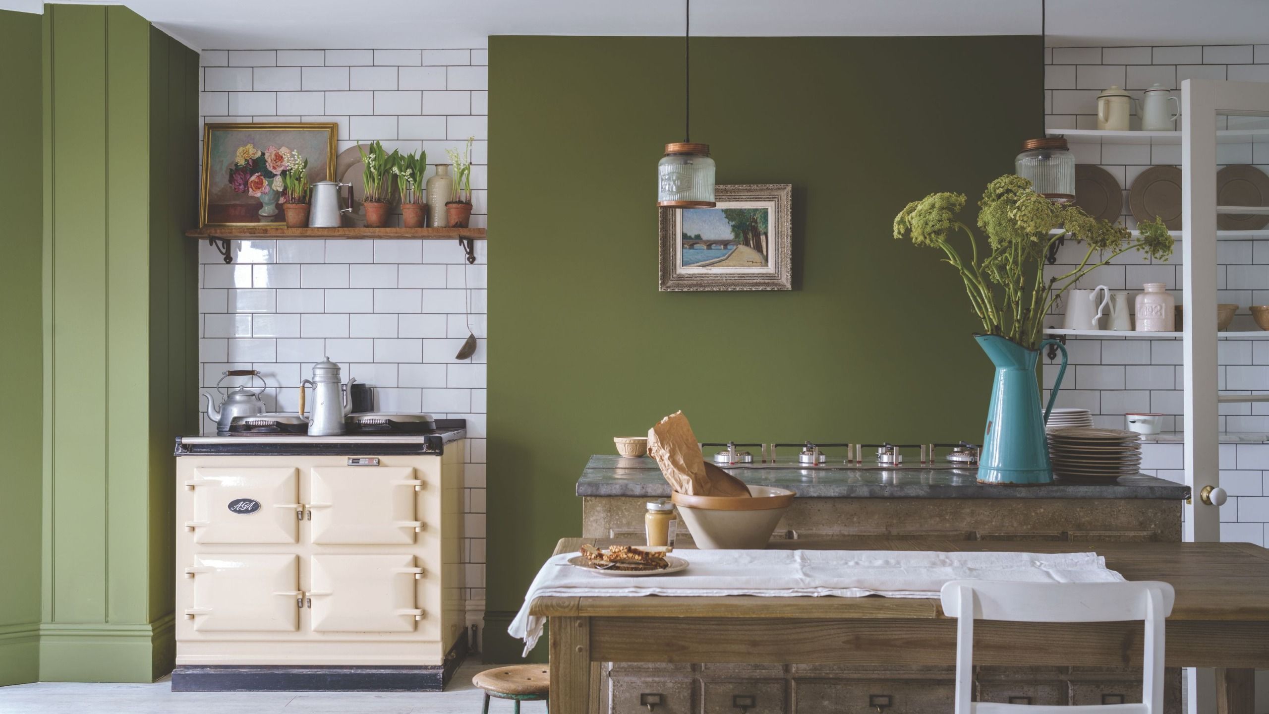
Organic greens remain the foundational backbone of the autumn landscape, reflecting the lingering foliage and deep woods as temperatures drop.
- Cardamom: A sophisticated, green-infused brown that anchors a room with rich warmth.
- Treron: A cult-classic gray-green that offers subtle, muted undertones.
- Bancha: A beloved, deep mossy green that mirrors the vibrant earthiness of outdoor greenery.
- Tack Room Door: A deeply complex, moody red-brown paint that looks exceptionally rich when applied in finishes like Flat Eggshell, particularly on tongue-and-groove walls in attic spaces or snugs.
2. The Unexpected Blues
Injecting blue into an autumn palette challenges the conventional wisdom that cooler colors belong exclusively in spring and summer.
- Stone Blue: A powdery, mid-tone blue that shines when juxtaposed against grounding greens.
- Selvedge: A faded, denim-inspired blue that adds a soft, approachable contrast to heavier architectural elements.
3. The Fiery Highlights
Instead of defaulting to standard orange or bright primary reds, the palette utilizes nuanced, complex warm pigments to capture the literal and figurative heat of the season.
- Etruscan Red: An almost brown-red that provides deep, historic gravity.
- Harissa: A fiery red-meets-orange hybrid that introduces an intense, glowing warmth, particularly effective in spaces with high concentrations of natural light.
- Straw: A warmer, more buttery take on yellow that diffuses soft ambient light, serving as a vital bridge between dark architectural elements and bright daytime sun.
Official Responses and Expert Insights
The philosophy behind the ‘Colors of Autumn’ palette is deeply rooted in observation of the natural world and a rejection of rigid seasonal rules.
"I will always consider the obvious connotations of fall with amber and burnt reds, but it’s lovely to consider other elements like wet stone and glistening lichen on boulders and long, low light casting delicious shadows through trees and over fields," notes Patrick O’Donnell, Brand Ambassador at Farrow & Ball. "It’s my favorite time of year."
Addressing the intentional exclusion of traditional bright oranges and heavy wine shades this season, O’Donnell explains the strategy behind the edit: "I deliberately didn’t go for wine colors or oranges this year… but wanted to look to more ‘grounded’ and moody colors. Blue is still a big part of autumn and should be present in our considerations, and it’s a false path to decorate for a season; this is more about color shifts and mood than decoration."
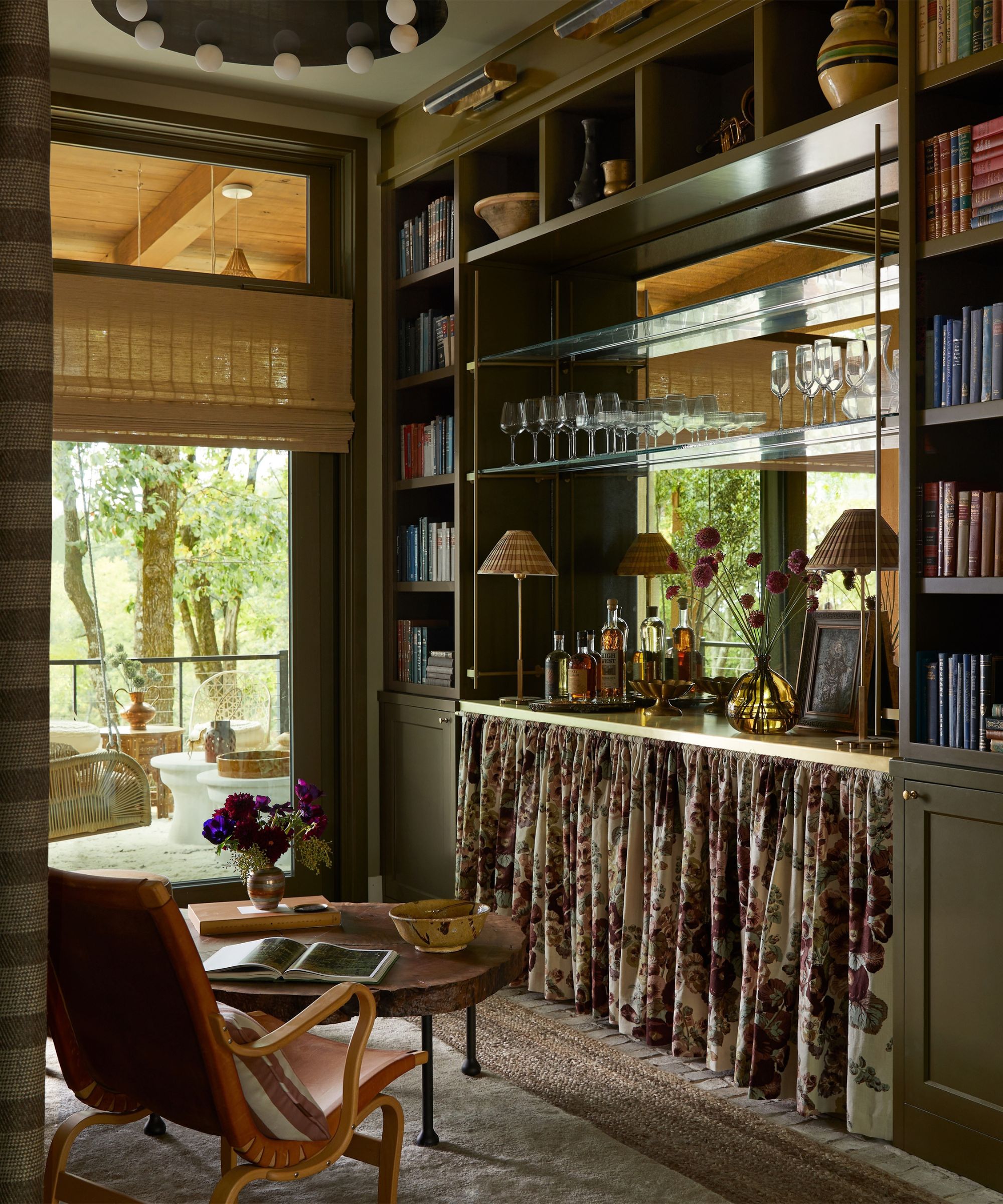
O’Donnell also highlights the multi-sensory nature of autumn design, noting how interiors must adapt to a changing lifestyle as the year winds down: "I think autumn is a particularly sensory time; clocks change, our food habits change, even the scent of candles shifts from lighter floral notes to tobacco and leather notes, the scent of an old dust jacket or well-worn library chair…"
When asked how homeowners can practically apply these divergent shades, O’Donnell recommends focusing on spaces with high concentrations of built-in cabinetry. "I think my three favorites from this mini edit would be Tack Room Door, Cardamom, and the wonderfully complex Stone Blue," he suggests. "All three would work harmoniously together — maybe in a kitchen where it’s easier to play with multiple colors due to the higher concentration of cabinetry in the space."
Implications for Modern Interior Design
The shift away from strictly monochromatic, seasonal cocooning toward a blended palette carries several significant implications for interior designers and homeowners alike:
- Longevity and Timelessness: By integrating blues, yellows, and fresh reds alongside earthy browns and greens, rooms decorated in this style transcend a single season. A kitchen featuring Cardamom cabinetry paired with Stone Blue walls feels appropriately grounded for October yet remains fresh and inspiring come spring.
- The Role of Lighting: As daylight hours shorten, the interplay between artificial lighting and wall paint becomes critical. Complex pigments like Straw and Harissa act as light amplifiers, capturing low-angled autumn sunbeams and radiating a warm, golden ambiance throughout open-plan spaces.
- Multi-Sensory Spatial Design: The trend encourages a departure from purely visual aesthetics. By acknowledging the sensory shifts associated with autumn—such as the psychological need for comfort balanced with the intellectual stimulation of rich color contrasts—designers can craft spaces that actively promote mental well-being during months prone to seasonal lethargy.
Ultimately, Farrow & Ball’s latest color narrative urges a re-evaluation of how we inhabit our homes during transitional months. By embracing a palette that is as multifaceted as the autumn landscape itself, interior design steps out of the shadows of convention and into a brighter, more balanced future.
