

Selecting a paint color for a residential interior is rarely a simple undertaking. It is a process that frequently induces anxiety, second-guessing, and occasionally domestic disputes. With literally thousands of hues, shades, and tints available at the local hardware store or design studio, color selection can quickly spiral from an exciting creative venture into an overwhelming ordeal. Furthermore, color perception is intensely subjective, mediated by individual psychological profiles, personal histories, and spatial contexts.
Certain colors have historically received a bad reputation in the design community—dismissed as overly boring, aggressively bright, garish, or impossibly difficult to coordinate with existing furnishings. Yet, intriguingly, these exact shades are frequently the secret weapons that seasoned interior designers and architects rely on to elevate residential spaces from ordinary to extraordinary.
"The colors we tend to stay away from are often the ones we end up liking the most," observes Richie David, CEO and president of Totally Home Furniture.
According to Samantha-Jane Agbontaen, an interior designer and founder of House Designer in the United Kingdom, many of these polarizing colors suffer from a poor reputation simply because homeowners have been exposed to the wrong iterations of them.
"I would never choose a paint color in isolation, since lighting, flooring, furniture, and other finishes in the room can completely change how it looks," Agbontaen explains.
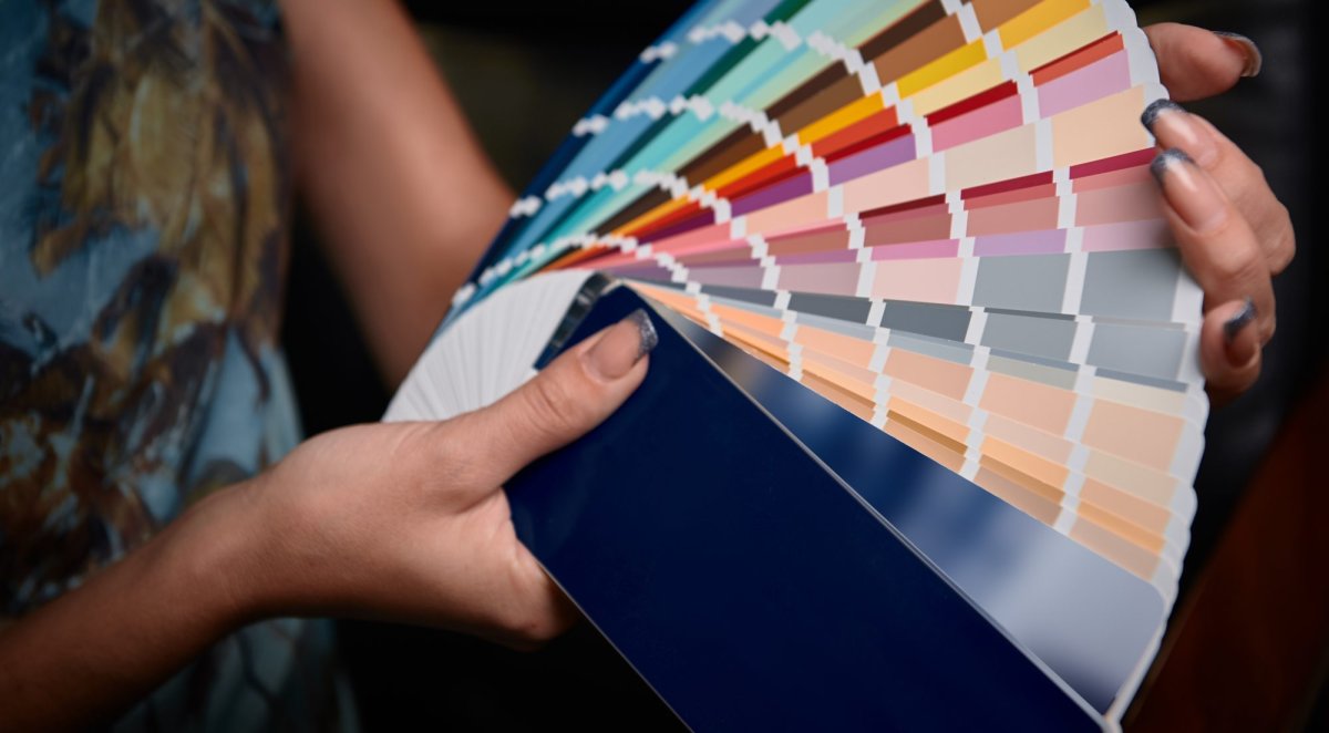
To demystify the process of choosing bold or unconventional palettes, industry professionals have identified five of the most divisive paint colors in contemporary interior design, explaining why homeowners should give them a second chance and how to properly execute them in domestic spaces.
Main Facts: The Psychology and Reality of Divisive Paint Colors
The debate surrounding interior paint colors is rooted in historical trends and shifting architectural norms. For decades, the American real estate market favored safe, frictionless neutrals—namely stark whites and flat beiges—designed to appeal to the broadest possible pool of prospective home buyers. Consequently, any color demanding emotional engagement, such as deep brown, rich black, saturated yellow, or dusty pink, was viewed as a financial liability.
However, modern interior design has shifted away from sterile minimalism toward hyper-personalized, expressive, and atmospheric environments. The core facts governing this shift include:
- Contextual Dependence: A paint color cannot be judged by a two-inch square swatch. Lighting temperature (Kelvin scale), room orientation (north-facing vs. south-facing), and neighboring textures drastically alter chromatic output.
- The Neutral Paradox: Colors traditionally categorized as risky—such as greige, charcoal, and dark olive—frequently function better as neutral backgrounds than traditional beige because they absorb or reflect light more dynamically.
- Undertone Awareness: The primary driver of paint failure is an unmanaged undertone (e.g., a greige with hidden purple notes or a brown with aggressive orange tones).
Chronology: The Evolution of Color Trends in Modern Homes
To understand why certain colors are viewed with suspicion today, it is helpful to look back at how residential color palettes have evolved over the last several decades.
The Late 20th Century: The Reign of Subdued Neutrals (1990s–2000s)
During the peak of the Tuscan-villa and suburban McMansion eras, warm beiges, mustard yellows, and terracotta browns dominated living rooms and kitchens. While initially cozy, overexposure led to these colors being heavily associated with dated, heavy-handed interior design.
The Great Gray Shift (2010s)
As a direct reaction to the warm tones of the previous decade, cool grays took over the design world. Propelled by the minimalist movement and open-concept floor plans, gray became the default background for everything from kitchen cabinetry to exterior siding.
The Post-Pandemic Pivot to Personalization (2020s–Present)
Following extended periods spent inside during global health lockdowns, homeowners began craving spaces that offered emotional comfort, grounding, and sanctuary. This psychological shift caused a mass rejection of clinical cool grays. Designers and homeowners began re-embracing moody, atmospheric, and deeply saturated tones—reclaiming colors that were once written off as too dark, too loud, or too dated.
Supporting Data: Understanding the Spectrum
When evaluating paint selections, industry standards rely on specific metrics to predict how a color will behave in a real-world environment.
- Light Reflectance Value (LRV): LRV measures the percentage of light a paint color reflects on a scale from 0 percent (absolute black) to 100 percent (pure white). Understanding LRV prevents homeowners from choosing dark colors for windowless rooms or overly bright whites for spaces flooded with intense southern light.
- Undertone Matrix: Nearly all architectural paints are mixed with secondary chromatic bases. For example, a gray paint may have blue, green, or violet undertones. Recognizing these hidden notes is critical to preventing color clashes with flooring and textiles.
Official Responses and Expert Insights
Industry leaders emphasize that overcoming color phobia requires shifting the mindset from "What is safe?" to "What is the room trying to achieve?"
1. Greige
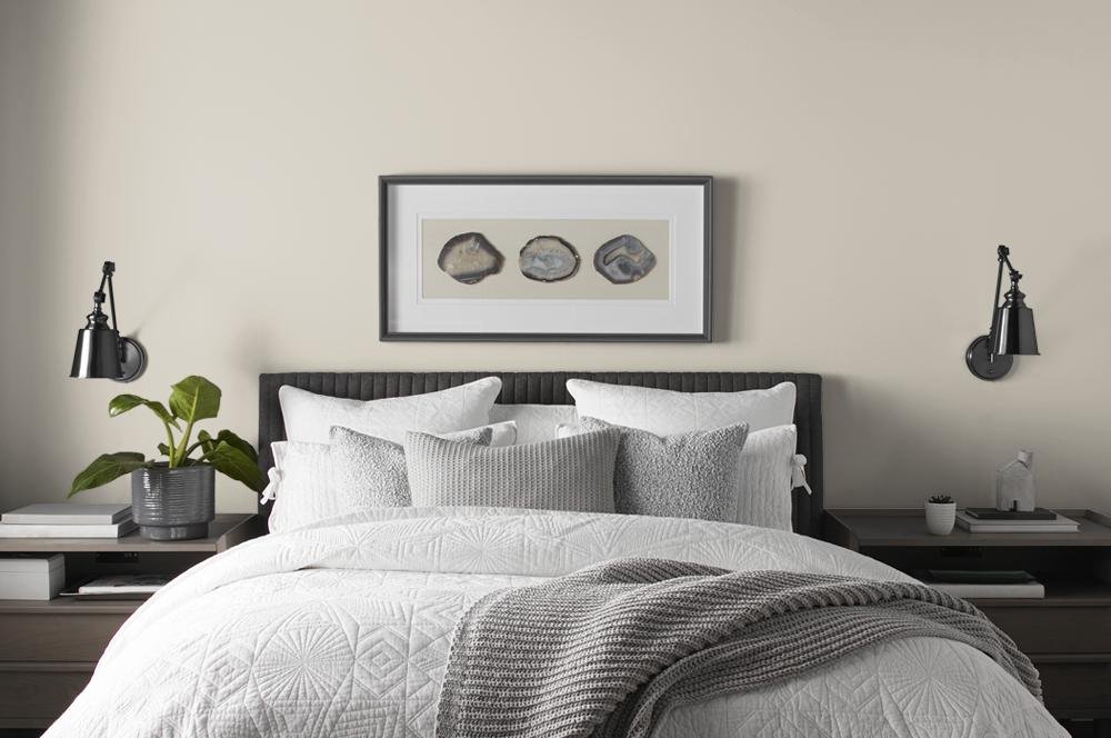
Greige—a hybrid of gray and beige—frequently battles accusations of being bland or uninspired. However, designers argue it is one of the most versatile tools in the decorator’s kit.
"I still use it because sometimes you need the walls to sit back and let the furniture, art, and materials do the work," says Agbontaen, who recommends selecting warmer, muddier iterations rather than formulations with excessive yellowing.
Branden Wells, CEO and founder of TrueCraft Construction in Costa Mesa, California, notes its practical advantages. "At a light reflectance value around 55, it’s got just enough brightness to make a small room feel larger, yet not so much that it will show every fingerprint like a stark white would," he says. Furthermore, its forgiving nature makes maintenance and touch-ups fast and seamless.
- Expert Recommendations:
- Revere Pewter by Benjamin Moore
- Vintage Pewter by BEHR
2. Brown
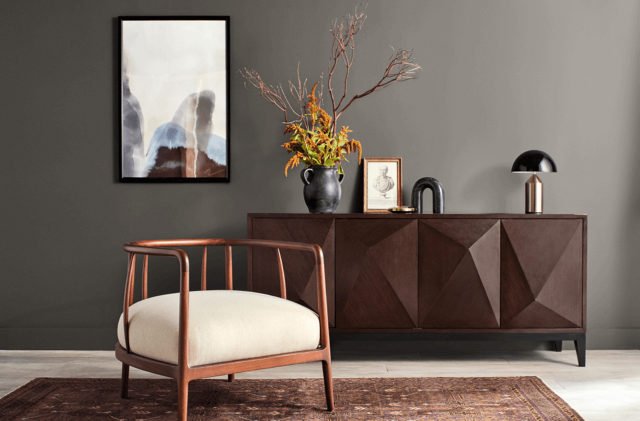
Historically associated with uninspiring 1970s paneling or tired kitchen cabinets, brown is currently undergoing a sophisticated renaissance.
"A good brown paint feels warm and grounded, and it works particularly well with cream, natural wood, brass, and burgundy," Agbontaen notes.
Elena Navarro, an interior designer and professional organizer at Sparkly Maid Austin, points out that brown is deeply nuanced, spanning rich shades like chocolate, tobacco, coffee, and caramel.
"Rather than using brown in a one-dimensional way, choose a more interesting hue that’s full of nuances," Navarro suggests. "Lighter upholstery or accessories, metallics with warm undertones, organic materials, and luxurious textures will all look stunning against a backdrop of brown walls."
- Expert Recommendations:
- London Clay by Farrow & Ball
- Urbane Bronze by Sherwin-Williams
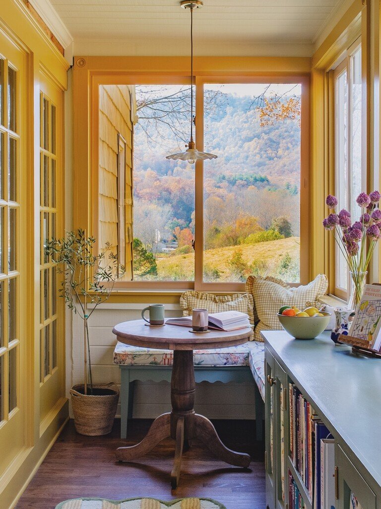
3. Yellow
Yellow is frequently avoided out of fear that its high energy will overwhelm a space. However, designers maintain that muted variations provide exceptional warmth.
"Muted butter, straw, and ochre shades have gray or green undertones that serve as neutrals, injecting warmth into rooms that are overly cool or receive little to no natural light, such as north-facing rooms," Navarro explains.
- Expert Recommendations:
- Hawthorne Yellow by Benjamin Moore
- India Yellow by Farrow & Ball
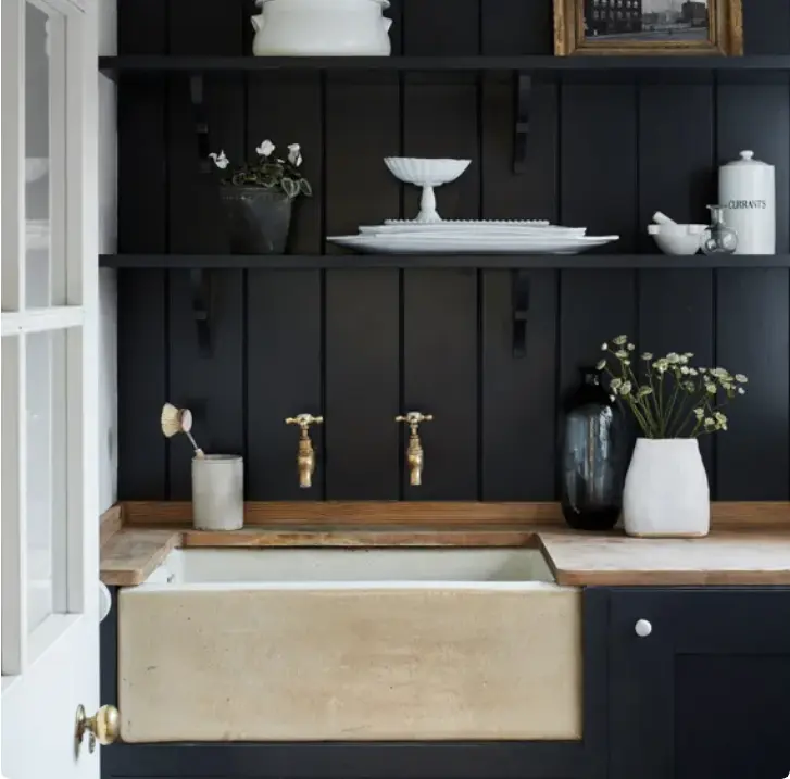
4. Black
While casual observers often assume black paint creates a gloomy, claustrophobic environment, professionals view it as an instrument of definition and sophistication.
"When used correctly, black paint can be subtle and elegant while still making a bold statement," David says, noting his preference for applying it to doors, cabinetry, and built-ins to create architectural contrast.
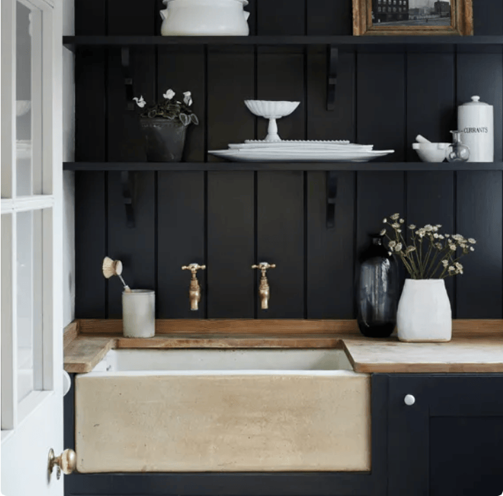
Navarro adds that all-over black can successfully trick the eye in compact footprints. "It’s a great option for small rooms that can feel larger since it obscures corners and adds dimension."
- Expert Recommendations:
- Railings by Farrow & Ball
- Tricorn Black by Sherwin-Williams
5. Pink
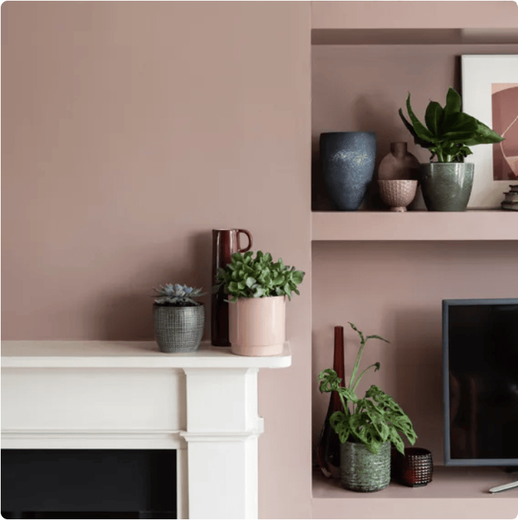
Often pigeonholed as overly juvenile or exclusively tied to "Barbiecore" aesthetics, sophisticated dusty pinks are redefining modern residential elegance.
"Dusty pinks have beige, gray, or clay undertones and work beautifully as neutrals in a variety of spaces," Navarro states. Beyond looking striking in studies and powder rooms, pink is uniquely flattering to human skin tones, making it an inspired choice for primary bedrooms and ensuites.
- Expert Recommendations:
- Stolen Kiss by BEHR
- Sulking Room Pink by Farrow & Ball
Implications for Homeowners and the Real Estate Market
The shift toward embracing divisive paint colors carries significant implications for both residential design and property valuation.
For current homeowners, breaking away from the safe confines of neutral palettes offers an affordable, high-impact method to customize their living environments, enhance architectural features, and improve psychological well-being through intentional color psychology.
From a real estate perspective, the old rule that homes must be painted in neutral, inoffensive tones before listing is evolving. While hyper-personalized, ultra-bright neon colors may still alienate prospective buyers, sophisticated applications of greige, deep browns, warm blacks, and dusty pinks demonstrate architectural intentionality and high-end design sensibility. Ultimately, paint is no longer viewed merely as a blank canvas to hide a room’s flaws, but as an active, structural design medium capable of completely transforming a home.
