For decades, the pristine, all-white kitchen has reigned supreme as the quintessential "safe" choice in home design. Synonymous with cleanliness, spaciousness, and modern minimalism, white and ultra-cool gray palettes have dominated architectural digests and remodeling wish lists alike. However, as interior design trends pivot toward personalization, comfort, and emotional resonance, homeowners and designers are increasingly reckoning with the downside of this aesthetic: the risk of creating a space that feels cold, clinical, and uninviting.
The modern culinary space is no longer treated merely as a utilitarian area for food preparation. Instead, it has evolved into the true heart of the home—a multi-functional hub for family gatherings, late-night conversations, and casual entertaining. Consequently, the mandate for kitchen design has shifted dramatically. The modern objective is to strike a delicate architectural balance: crafting a palette that feels deeply warm, cocooning, and welcoming, while avoiding the claustrophobic trap of a dark, cramped room.
According to leading interior designers and color experts, achieving this sweet spot relies on high-saturation neutrals, thoughtful paint placement, and a nuanced understanding of undertones. From rich, moody browns to earthy greens and warm charcoals, top professionals share their go-to strategies for infusing kitchens with timeless warmth and elegance.
Main Facts: The Shift Away from Clinical Minimalism
The contemporary interior design landscape is witnessing a definitive retreat from stark, cool-toned color schemes in favor of richer, more tactile palettes.
The Fall of the Sterile White Kitchen: While white kitchens offer perceived longevity, they frequently lack emotional warmth, often requiring deliberate textural intervention to feel like a home.
The Rise of Saturated Neutrals: Designers are turning to high-depth, warm hues—such as muddy taupes, muted ochres, rich browns, and deep charcoals—to create an enveloping atmosphere.
Strategic Color Application: Rather than overwhelming a space, color is now applied with precision, utilizing techniques like color-drenching, contrasting kitchen islands, and coordinating hardware to maintain balance.
Material Synergy: The success of a warm kitchen color scheme heavily depends on its interaction with classic materials like marble, soapstone, brass, and natural wood grain.
Chronology of a Trend: How Kitchen Palettes Evolved
To understand why warm colors are capturing the zeitgeist of modern kitchen design, it is helpful to trace how homeowners arrived at this aesthetic crossroad.
The Mid-to-Late 20th Century: Kitchens transitioned from pastel-heavy mid-century spaces to structured, wood-dominant cabinetry designs, often favoring natural oak, cherry, and pine finishes.
The 2000s and 2010s (The White & Gray Era): Propelled by the rise of open-plan living and real estate staging trends, the all-white and cool-gray kitchen became the universal standard. Stainless steel appliances and quartz countertops solidified this sleek, sterile look.
The Late 2010s (The Return of Color): Homeowners began introducing accent islands, primarily in navy blue or forest green, while keeping perimeter cabinetry neutral.
The 2020s to Present (The Cocooning Movement): Sparked by a collective cultural desire for comfort, security, and sanctuary within the home, design philosophy shifted toward organic warmth. Earthy tones, textured wood stains, and complex, muddy pigments took center stage, proving that dark and saturated colors can feel expansive rather than confining.
Supporting Data & Designer Insights: 7 Warm Color Directions
Top designers outline seven distinct color categories capable of transforming a kitchen from stark to stunning, offering specific guidance on how to implement them successfully.
1. Rich Brown Hues
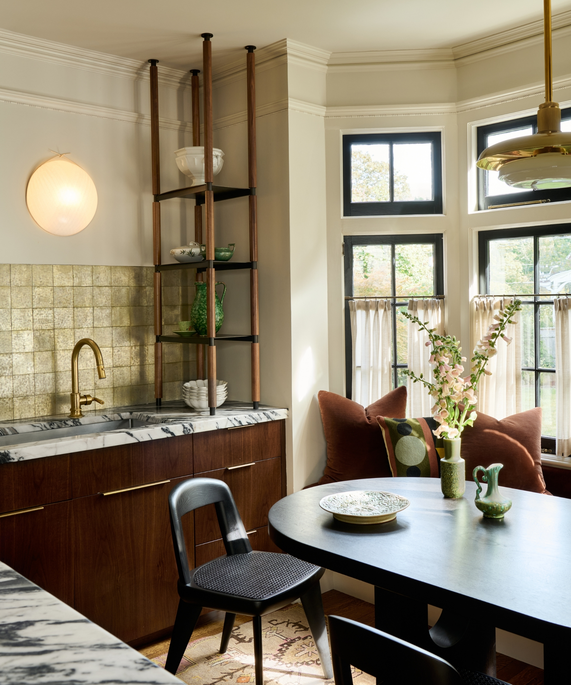
Often relegated to autumnal decor, rich brown is experiencing a major renaissance as a sophisticated, dark neutral. It pairs exquisitely with classic kitchen materials like marble, aged brass, and natural wood.
Designer Application: Jess Cooney Interiors successfully utilized dark wood cabinetry alongside rich upholstery in an adjoining dining nook to establish continuity and depth.
Notable Shades: Farrow & Ball’s Broccoli Brown and Benjamin Moore’s Tudor Brown.
2. Soft, Muted Yellow Shades
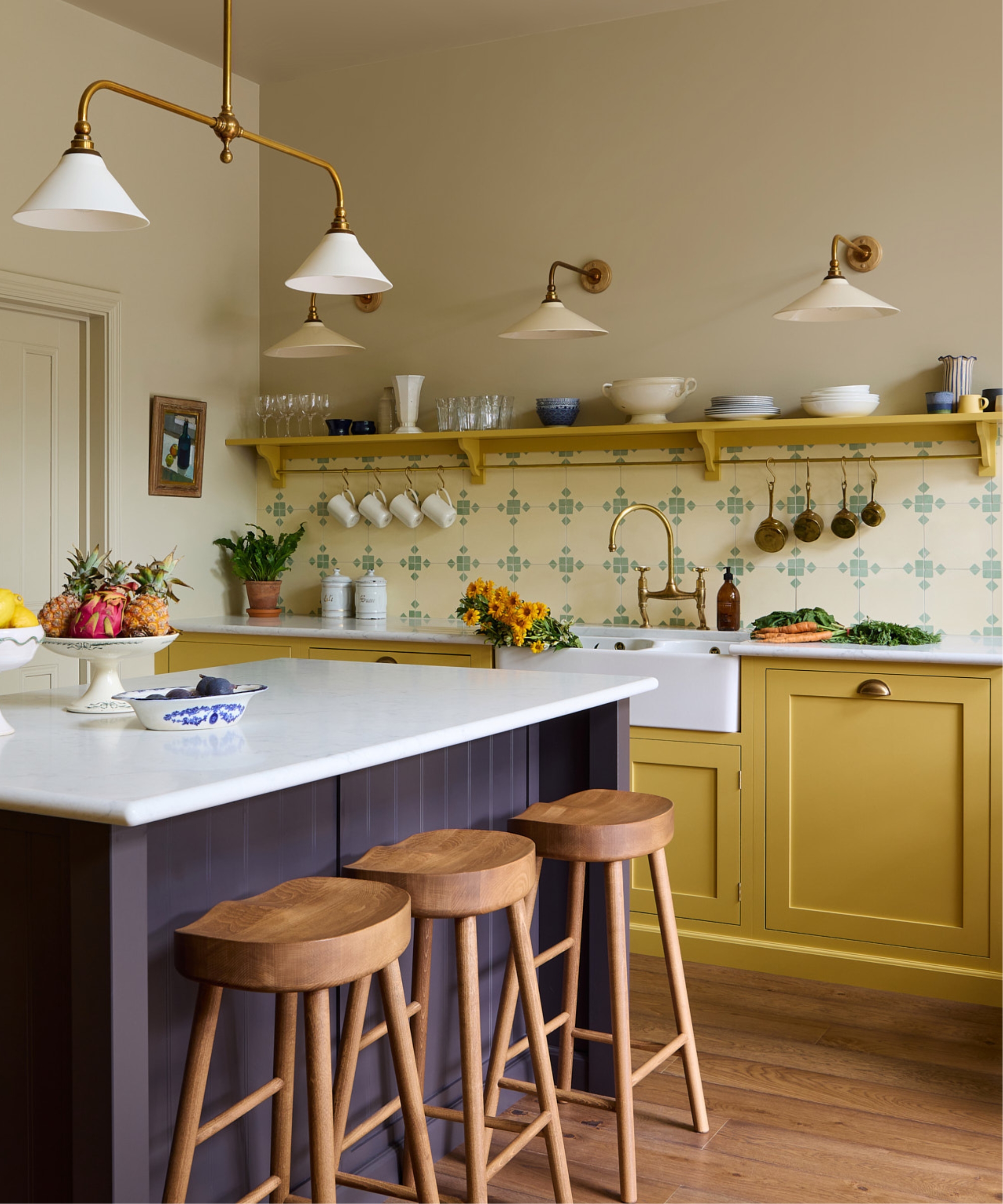
Moving away from harsh primary yellows, muted, earthy, and ochre-based yellows introduce a sense of organic sunshine into a room without feeling overwhelming.
Designer Application: Interior designer Uns Hobbs champions ochre yellows for their ability to lift the spirits. In one recent project, Hobbs paired Sudbury Yellow cabinets with a deep aubergine island to ground the space, keeping countertops and walls pale to let the yellow sing.
3. Classic Wood Tones
Wood grains and surface variations bring unmatched texture and organic richness to a kitchen without requiring a solid paint commitment.
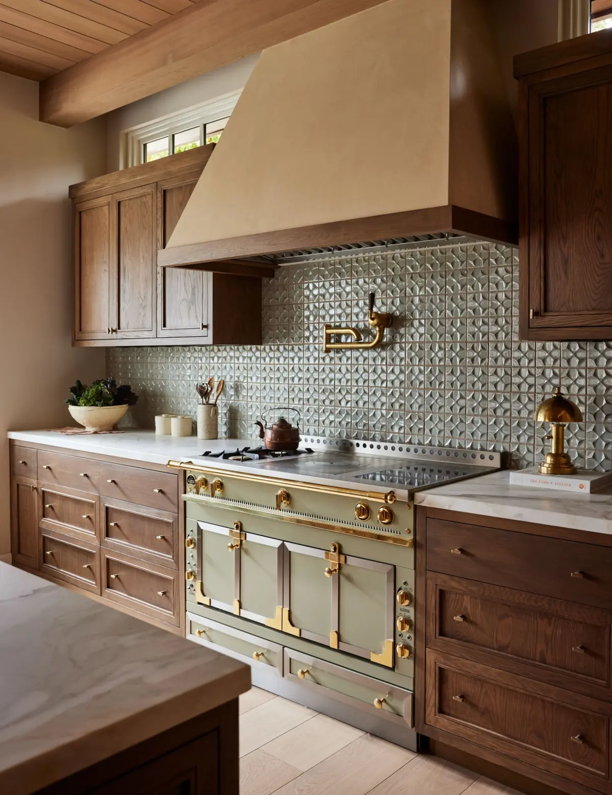
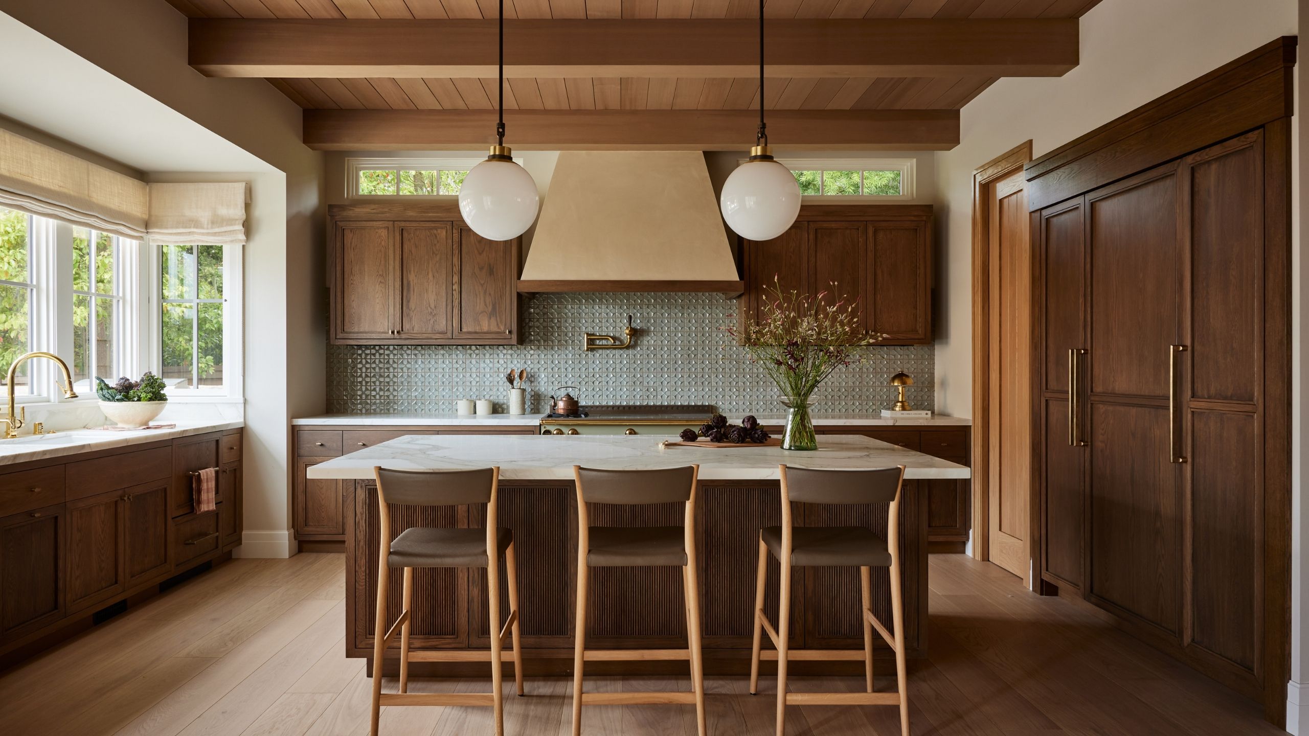
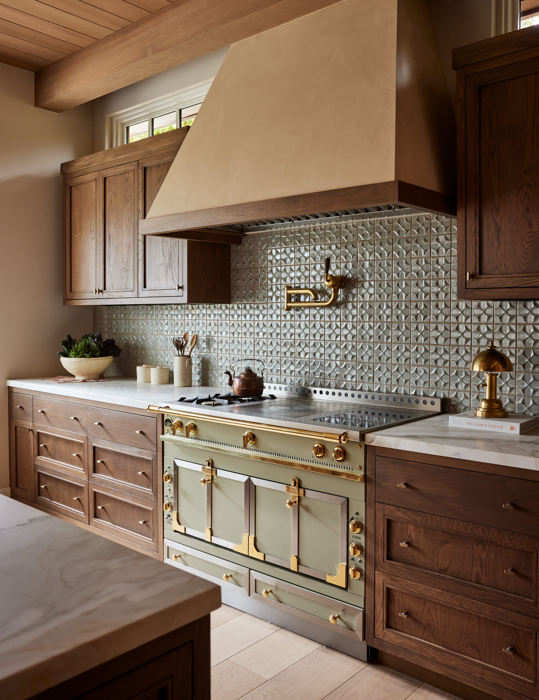
Designer Application: Anne Pappas utilizes wood elements across various architectural touchpoints, including tongue-and-groove ceiling treatments and islands crafted from indigenous coastal woods like Cypress, Mahogany, and modern White Oak. Similarly, designer Kristen Pena pairs stained oak perimeter cabinetry with calming Celadon green backsplash tiles.
4. Deep Red Hues
Ranging from rich burgundy to muddy oxblood and aubergine, deep reds offer an undeniably cocooning, sophisticated aesthetic that challenges the notion that dark colors make a room feel small.
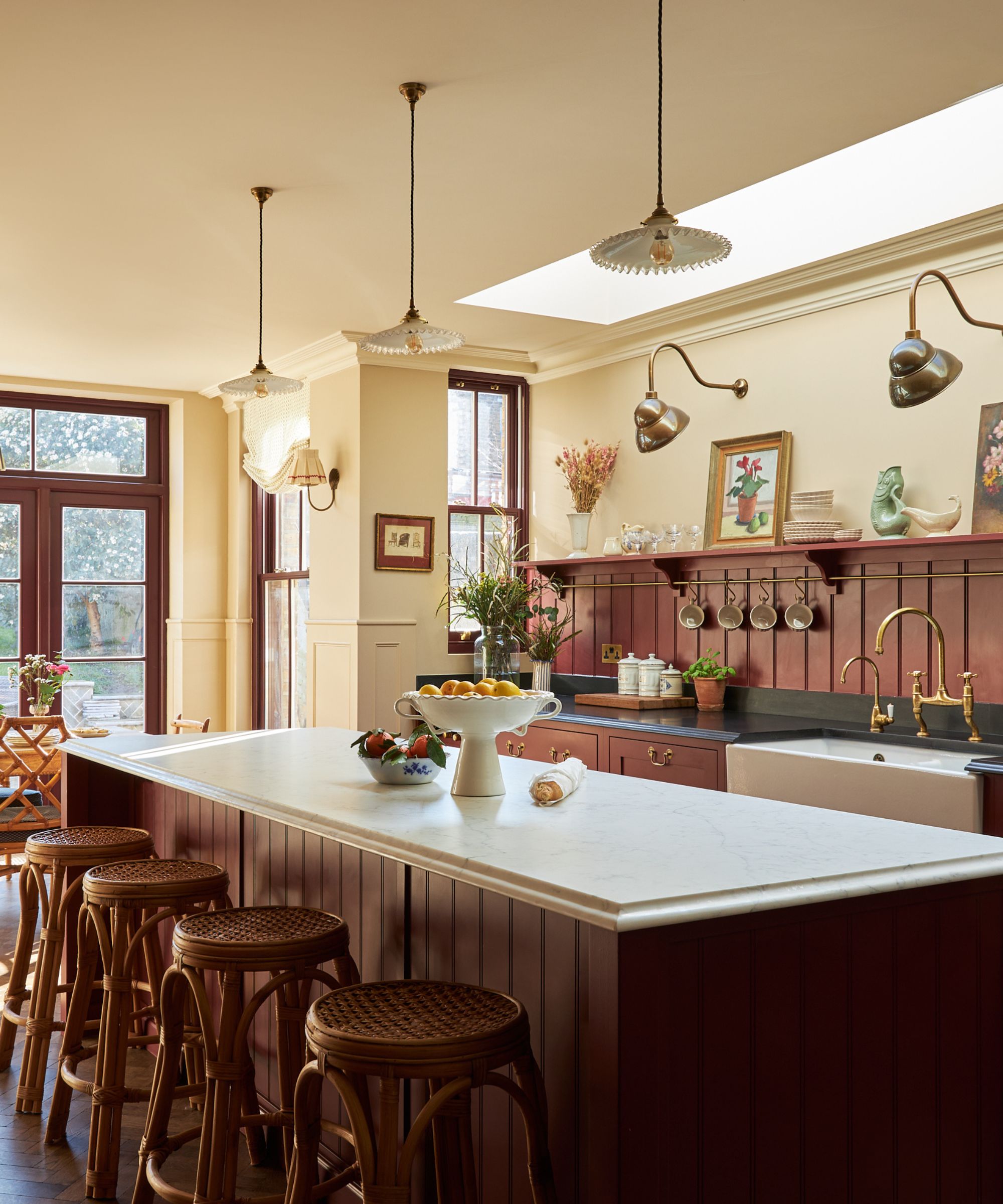
Designer Application: Uns Hobbs utilized Farrow & Ball’s Rectory Red across cabinetry, islands, and paneled backsplashes, balanced against warm neutral walls to maintain spatial brightness.
5. Warm, Muddy Neutrals
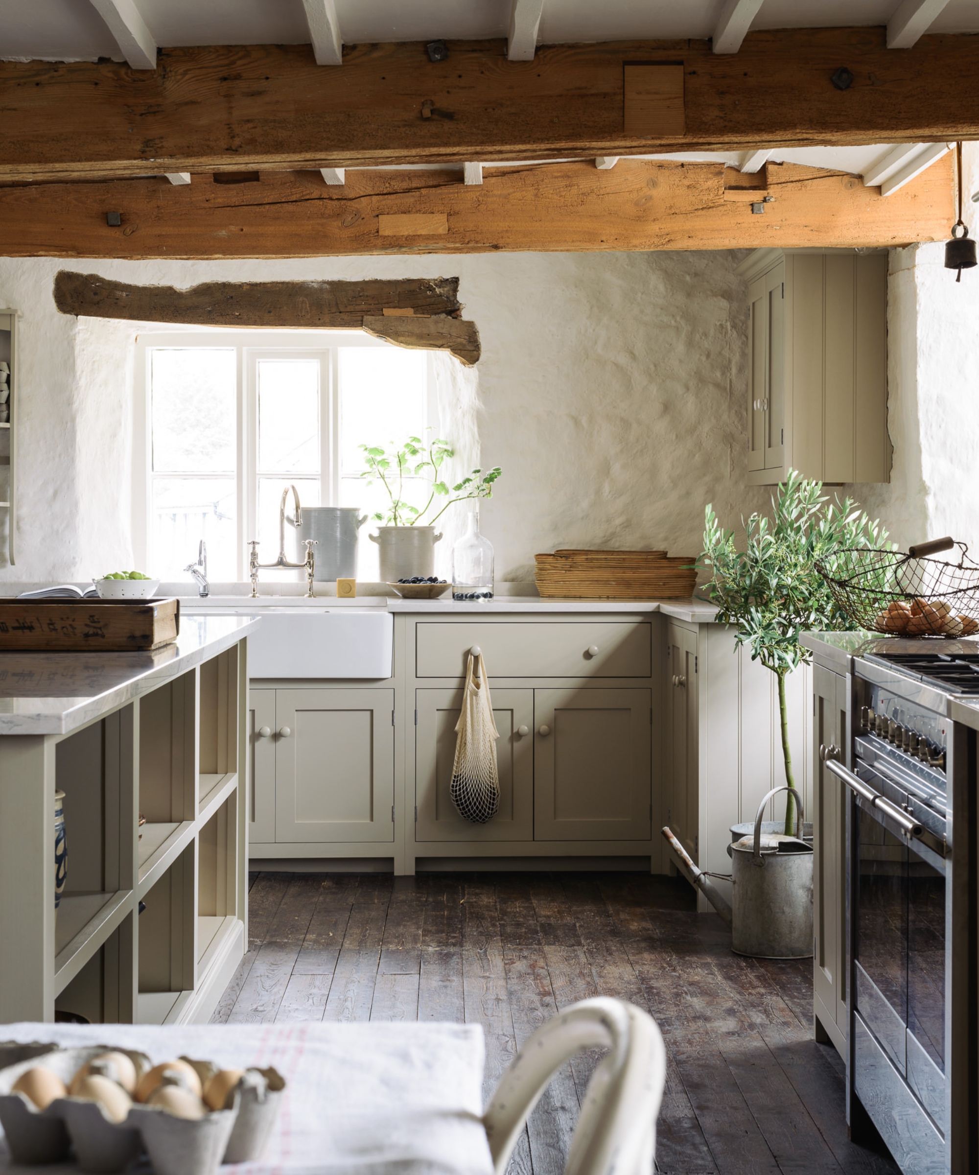
For homeowners hesitant to make a dramatic leap into saturated color, warm neutrals—such as putty, taupe, and mushroom—provide a comfortable middle ground.
Designer Application: Anna Franklin of Stone House Collective calls taupe the "quiet workhorse" of kitchen design. Shades like Farrow & Ball’s Oxford Stone or Joa’s White offer rich architectural depth that avoids the clinical feel of stark whites.
6. Earthy Greens
Moving past mint and sage, deeply saturated greens like olive, artichoke, and moss pull directly from nature to create grounded, timeless culinary spaces.
Designer Application: Kristen Pena emphasizes that the success of green relies entirely on tone, saturation, and complementary materiality, such as pairing olive green cabinets with marble countertops and warm stone backsplashes.
7. Deep Charcoals with Warm Undertones
Charcoal and near-black paints can appear daring, but selecting shades with red or blue-free brown undertones completely alters their performance in a space.
Designer Application: Nick Cryer of Berkeley Place notes that deep charcoal with warm undertones responds dynamically to natural and artificial light. Applied consistently across cabinetry, walls, and woodwork in single-aspect or lower-ground spaces, these colors create an enveloping, intimate atmosphere rather than highlighting architectural limitations.
Official Responses and Expert Perspectives
The architectural and interior design community overwhelmingly agrees that the psychological impact of color within the home cannot be overstated.
"Colors with warm undertones create a rich, storied, somewhat architectural feeling, whereas your stark whites and grays often feel sterile," explains Anna Franklin of Stone House Collective.
Paint manufacturers and color experts echo this sentiment, emphasizing that modern paint formulations are engineered to react dynamically to shifting daylight. Dominic Myland of Mylands notes:
"Used thoughtfully, deeper shades… can make a kitchen feel cozier without making it feel smaller. It’s about balancing the color with natural light, coordinating materials, and the surrounding palette."
Designers consistently advise that when committing to high-impact colors, homeowners should focus their efforts on the elements that command the most visual real estate: painted cabinetry, countertop stone selections, and backsplashes. By anchoring these major surfaces in warm tones, the entire room achieves immediate visual cohesion.
Implications for Future Home Design and Real Estate
The definitive shift away from clinical minimalism toward warm, richly layered kitchen palettes carries significant implications for both residential architecture and the real estate market.
Longevity Over Fast-Trend Turnover: While all-white kitchens were long championed for their supposed timelessness, the current embrace of earthy neutrals, natural wood, and complex pigments proves that personality and warmth have superior staying power. Homeowners are investing in bespoke, emotionally resonant spaces designed to last decades rather than years.
The Evolution of Open-Plan Living: As open-plan layouts continue to dominate residential floor plans, the kitchen must harmonize visually with adjoining living and dining areas. Warm, cohesive palettes facilitate a seamless visual flow between cooking and lounging zones.
Property Valuation Impacts: Real estate analysts note that thoughtfully customized, high-end kitchens featuring architectural warmth, artisanal wood tones, and sophisticated color drenching often command higher perceived value than generic, builder-grade white spaces, signaling craftsmanship and intentional design to prospective buyers.
Ultimately, as homeowners spend more time interacting with their living spaces, the kitchen is rightfully reclaiming its historic role as the warm, nurturing hearth of the home—proving that comfort and high design can coexist beautifully.