

Main Facts: The Great Bedroom Color Fallacy
For decades, conventional wisdom has handed homeowners a comforting, one-size-fits-all shorthand for designing a restful bedroom: walk down the paint aisle, grab a swatch of pale blue, soft gray, or cool green, and let the temperature of the color do the heavy lifting of relaxation.
However, top-tier interior designers are increasingly pushing back against this chromatic dogma. Serenity, they argue, cannot be selected from a paint chip based solely on color temperature. While a cool shade can indeed feel soothing under optimal showroom conditions, it can just as easily turn chilly, flat, stark, or clinical the moment it meets a room’s unique natural light, fixed architectural finishes, and existing furniture.
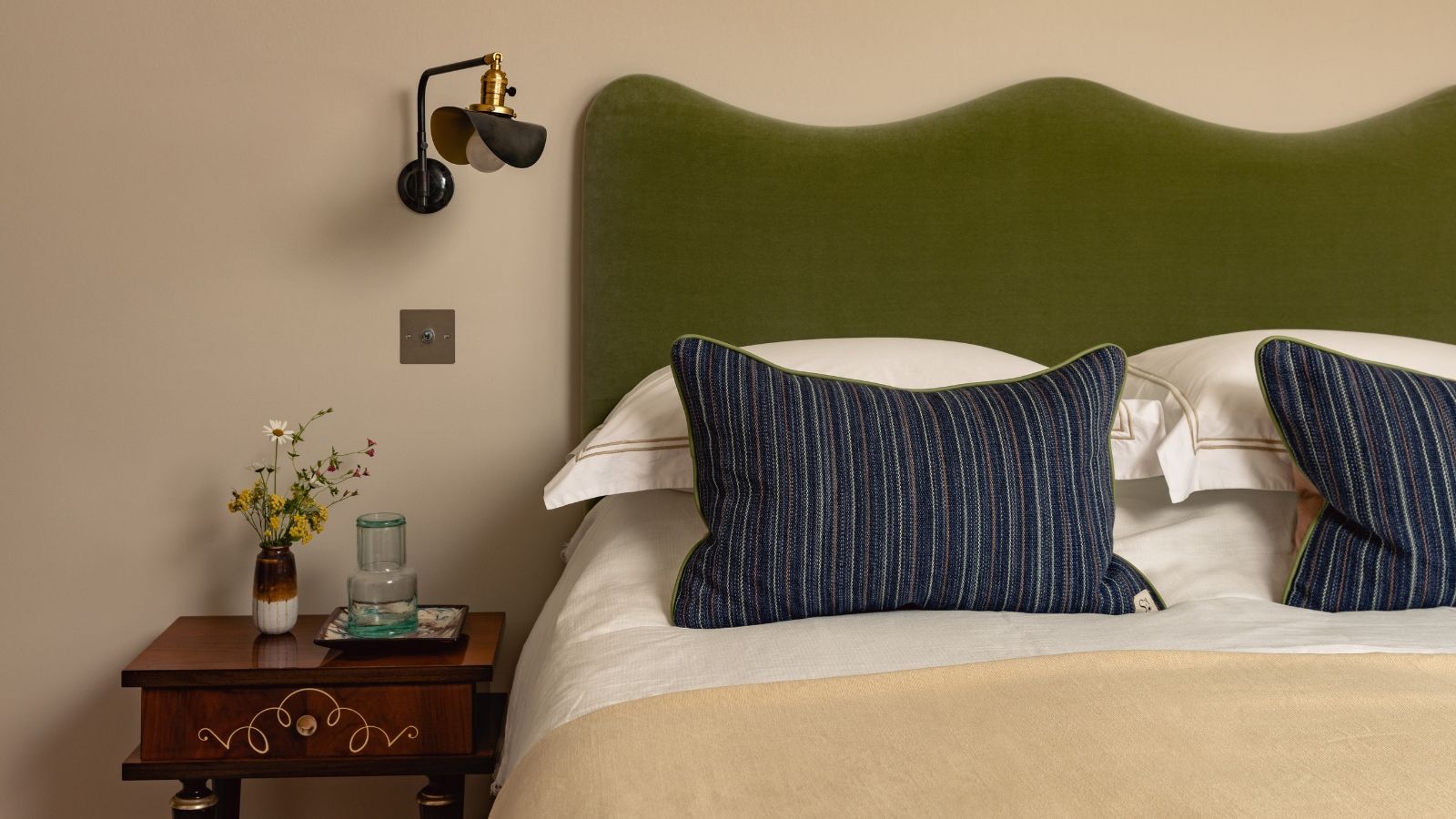
The most common bedroom color mistake is not choosing a cool color in the first place, but rather choosing one under the false assumption that "cool" automatically equals "calm." In practice, warm whites, mineral-infused neutrals, earthy pinks, ochres, rich browns, and muted reds can be every bit as restful as any icy blue. What truly matters is nuance: the hidden undertones, the level of saturation, the shifting quality of natural light throughout the day, and the cohesive way the entire room works together as an ecosystem.
Chronology & Context: How We Got Here
The evolution of bedroom color trends over the past twenty years has transitioned from stark minimalism to builder-grade neutral shells, and finally toward the nuanced, enveloping spaces designers advocate today.
- The Minimalist Era (Late 1990s–2010s): The rise of mass-market developer-led interiors flooded the market with optic whites, bright grays, and chrome finishes. These elements formed bright shells designed to make spaces look larger and cleaner, yet they bore little relationship to the organic woods, textiles, and art inside them.
- The "Cool-Calm" Movement: To combat clinical starkness, homeowners pivoted toward pale blue-grays and sage greens, treating them as universal sleep-inducers. However, without factoring in room orientation, these colors frequently read as steel or slate by late afternoon, mimicking waiting rooms rather than retreats.
- The Contemporary Shift Toward Depth and Warmth: Today’s leading design studios—including House of Honey, House of Rolison, Studio Alexandra, and Danebury Design Studio—have rejected formulaic color rules. They are steering clients toward "dirty" shades, complex undertones, and color-drenching techniques that prioritize emotional cocooning over mere visual expansion.
Supporting Data & Expert Insights: The Anatomy of Undertones
According to interior design professionals, a paint chip never tells the whole story. Lighting, orientation, and undertones dictate how a color behaves once applied to four walls.
The Problem with North-Facing Rooms
Ali Childs, founder of Studio Alexandra, notes that clean blues and grays feel exceptionally stark in north-facing bedrooms when teamed with brilliant-white woodwork and cool finishes. Sam Goold and Katie Bolton of Danebury Design Studio echo this, pointing out that pale neutrals and gray-blues lose their soul and become flat in limited natural light, particularly on gloomy afternoons or in the evening.
The Plot Twist: Understanding Undertones
"Undertones are the entire plot," says Tamara Kaye-Honey, creative director and principal designer of House of Honey. "A gray can suddenly go lavender, a beige can go yellow, and a white can become aggressively blue."
Kaye-Honey recommends painting large sample boards and inspecting them at three distinct times: in crisp morning light, flat afternoon light, and warm lamplight. A bedroom has multiple personalities, and the wall color must harmonize with all of them.
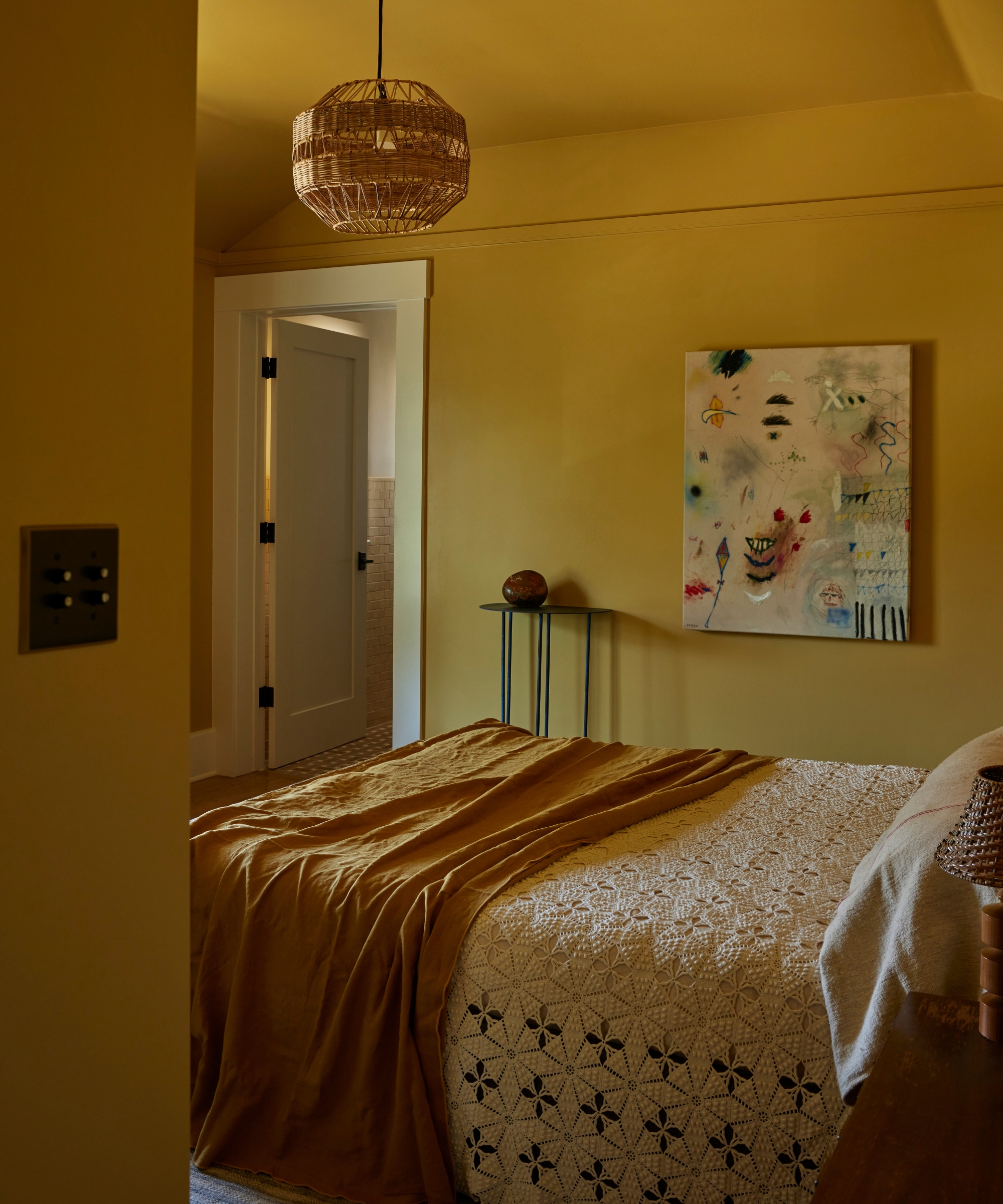
Designers utilize specific undertone manipulations to neutralize unwanted effects:
- Green undertones make blues feel aged and comfortably lived-in.
- Orange or brown notes temper pinks, stripping them of saccharine, nursery-like associations.
- Rusty browns ground burgundy, preventing it from looking overly jewel-like.
- Yellows inject life and warmth into otherwise chilly greens.
Alternative Warm Palettes That Invite Rest
Warmth does not equate to high energy. The most restful warm shades are softened, desaturated, or grounded with brown, gray, yellow, or red.
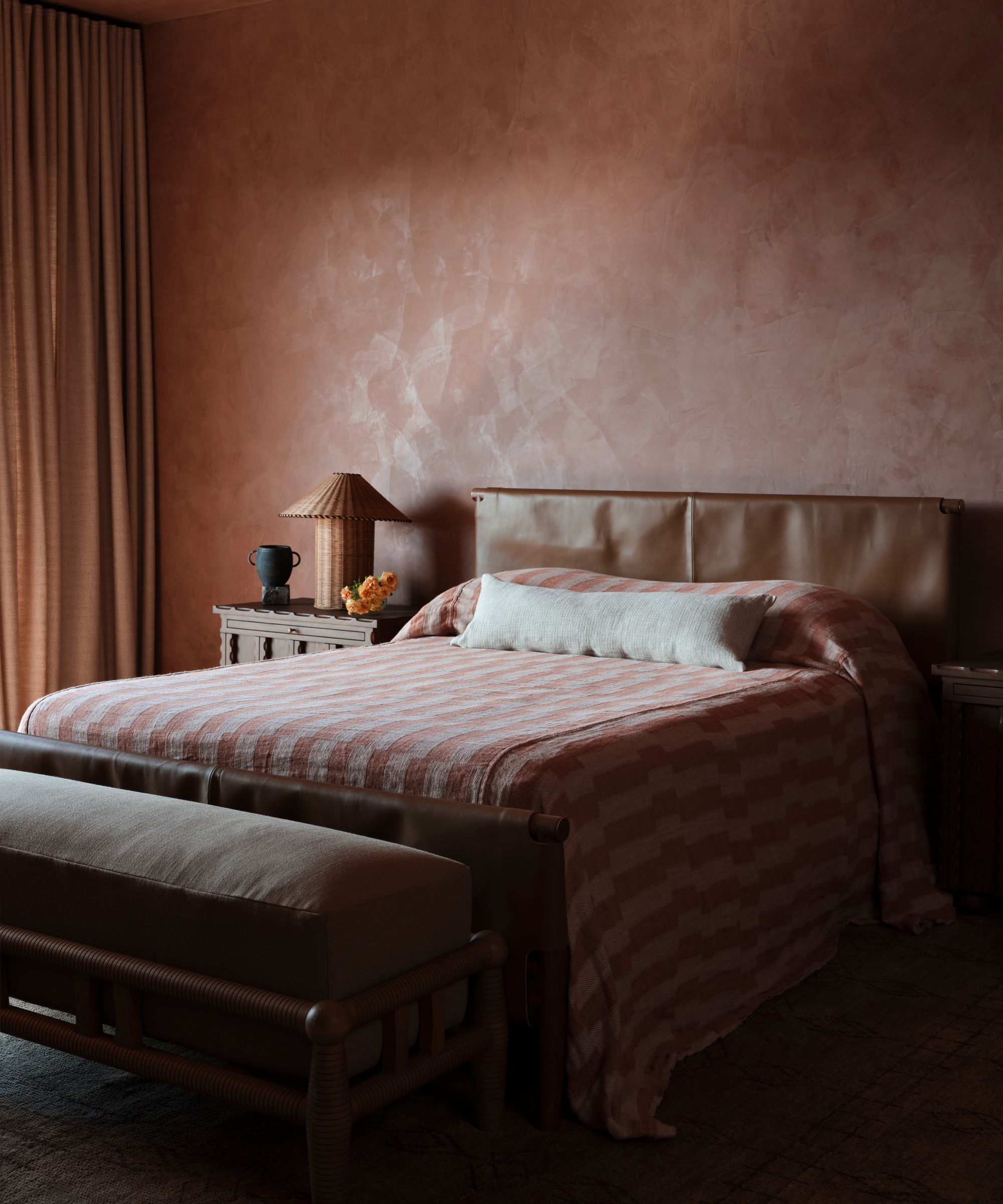
- Creamy Whites: Kirsten Blazek of A1000xBetter favors creamy off-whites like Dunn-Edwards’ Historic White over optic white for its soft, inviting nature.
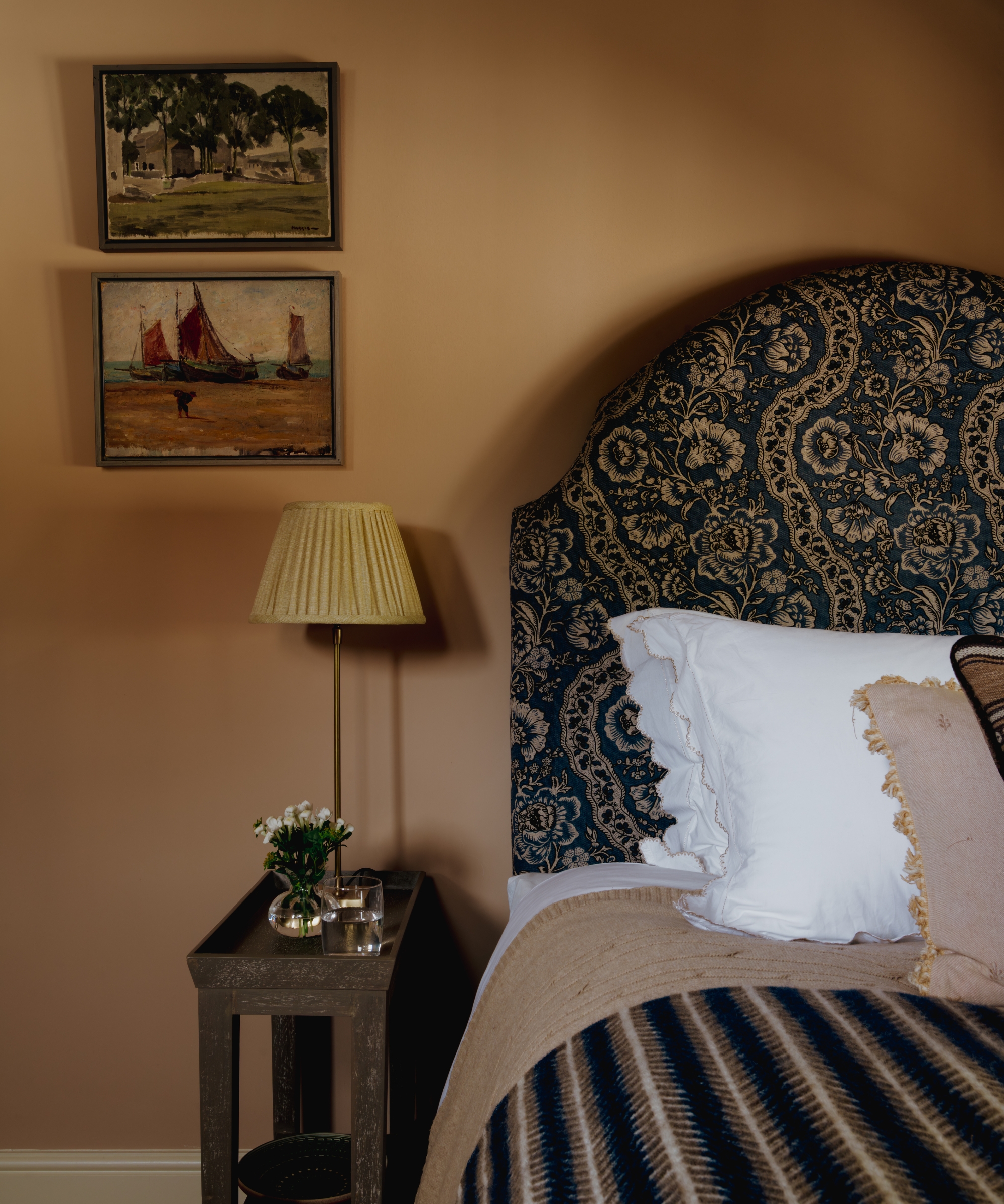
- Earthy Pinks: Jennifer Sucher of Sucher Studios champions desaturated peachy pinks that act as a "warm hug." House of Honey utilizes Farrow & Ball’s Setting Plaster and Dead Salmon, while Danebury Design Studio used Edward Bulmer’s Clove—a "tomboy pink"—to cocoon a north-facing bedroom.
- Rich Ochres and Browns: Electric Bowery color-drenched a guest bedroom in Benjamin Moore’s Citrine for a sunny yet soothing backdrop. Meanwhile, House of Rolison recommends Benjamin Moore’s Barista for enveloping brown and Dulce de Leche as a light neutral that connects organically with timber, stone, and plaster.
Official Recommendations: Designer-Approved Paint Palette
For those looking to overhaul their sleep sanctuary, leading studios recommend the following specific color references categorized by mood:
| Color Category | Designer / Studio | Recommended Paint Shade | Best Used For |
|---|---|---|---|
| Warm Whites & Bases | Shane & Pierce / House of Rolison | Farrow & Ball Joa’s White, Dunn-Edwards Cottage White | Creating a soft, light-reflective base without icy undertones. |
| Mineral Neutrals | Studio Alexandra / Plaster & Patina | Paint & Paper Library Stone III, Farrow & Ball Stony Ground | Grounding a room with outdoor-inspired, moody cream-and-stone hues. |
| Earthy Pinks & Clays | House of Honey / Danebury | Farrow & Ball Setting Plaster, Edward Bulmer Clove | Adding tactile warmth and sophistication without high visual stimulation. |
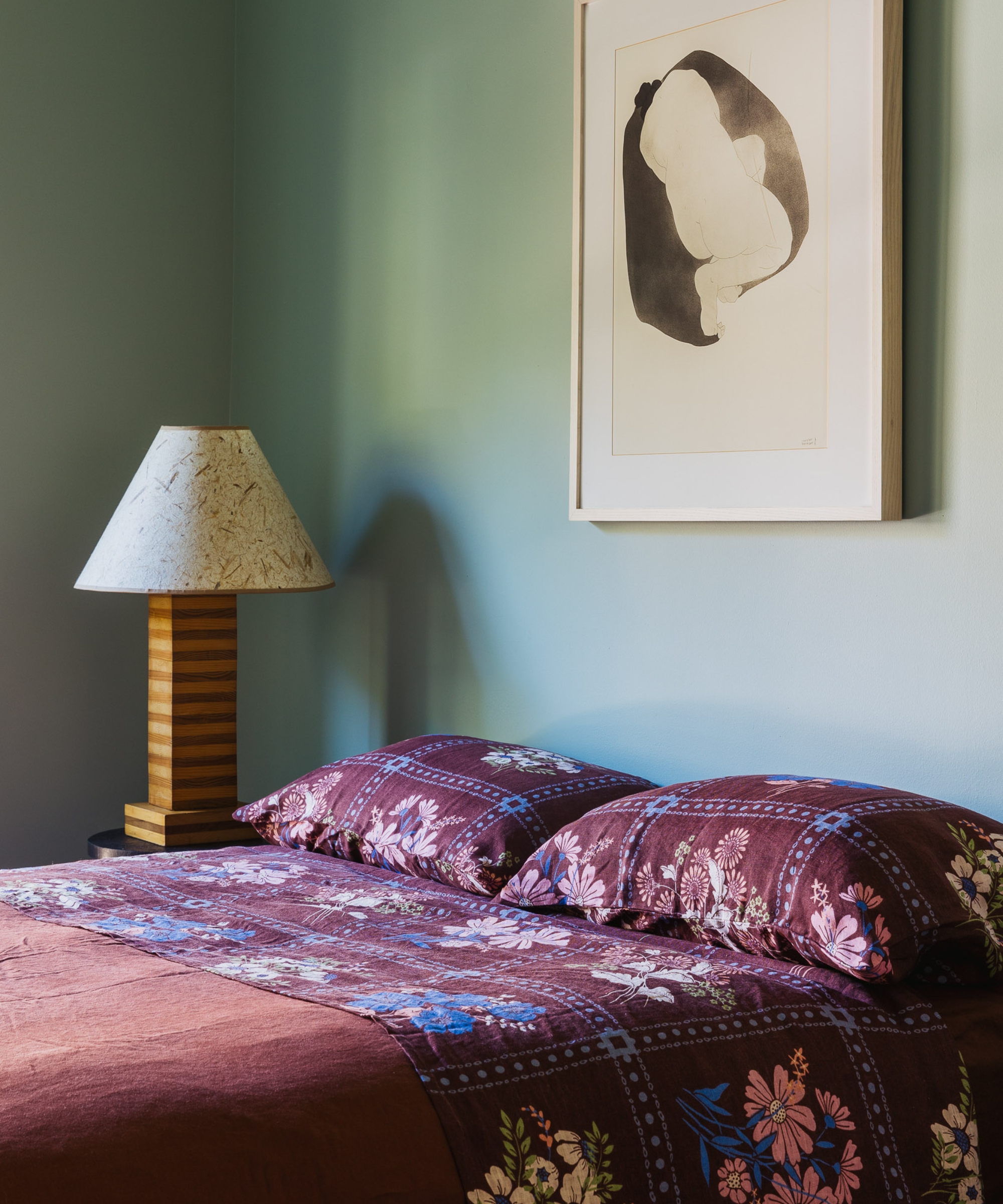
| Subdued Greens & Blues | House of Rolison / Jessica Blue | Benjamin Moore Mohegan Sage, Sherwin-Williams Arugula | Color-drenching spaces to achieve an intimate, cocooning atmosphere. |
Implications: The Holistic Blueprint for a Restful Bedroom
Achieving a truly calming bedroom extends far beyond selecting the right can of paint. The broader implications of this design philosophy require a holistic approach to room assembly:
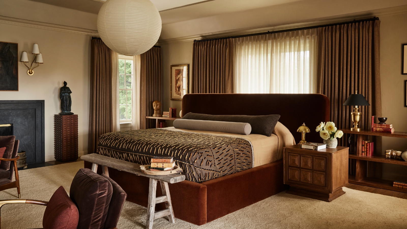
1. Layer, Don’t Match
The best bedroom schemes are layered rather than bought as a matching set. Combining tactile elements—such as crisp linen, heavy wool, natural wood, aged metals, vintage rugs, and subtle patterns—tempers the painted envelope. As Alexandra Azat of Plaster & Patina notes, high-contrast aesthetics create visual tension, whereas tone-on-tone palettes and color drenching allow the eye to travel effortlessly.
2. Rethink Artificial Lighting
Color temperature dictates emotional response after dark. "Nobody wants to relax under a 4000K LED," warns Tamara Kaye-Honey. Designers recommend layering bedside lamps, wall sconces, and low-level warm lighting (aiming around 2700K or lower) to create soft pools of illumination that enhance rather than flatten the room’s color profile.
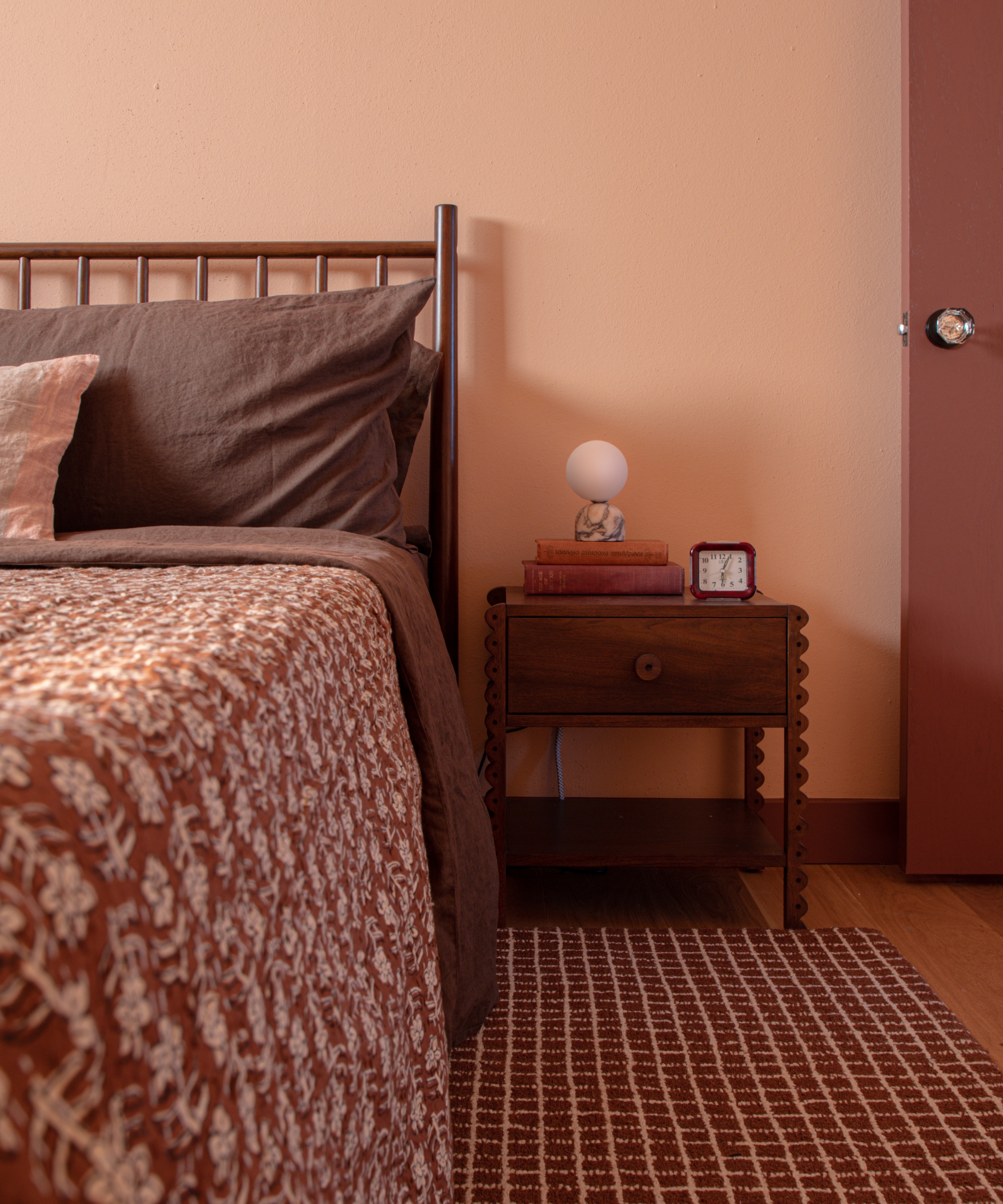
3. Let Natural Materials Lead
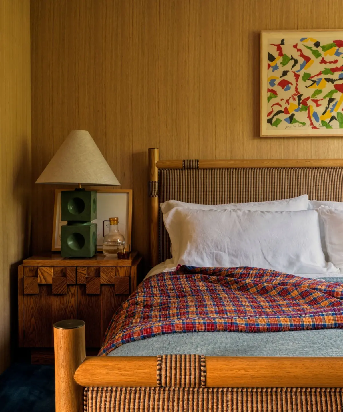
Paint isn’t the only route to a calming sanctuary. Designers like Nina Freudenberger utilize warm white-oak paneling to let natural grain and tonal variations supply depth—proving that a room’s dominant color can originate from raw earth rather than a pigment factory.
Ultimately, a truly calming bedroom defies rigid paint-chart rules. It should feel comfortable during the hours you inhabit it most, deeply connected to the natural materials surrounding it, and personal enough to quiet the mind and invite true rest.
