

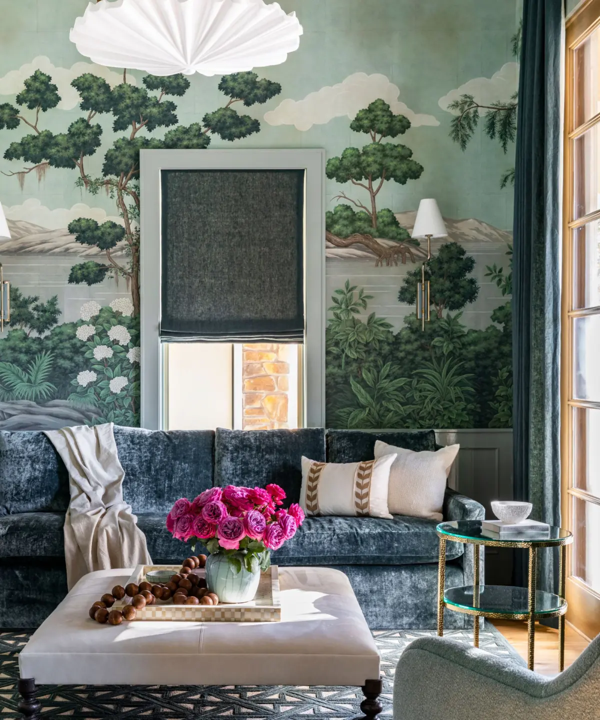
While black-and-white interiors have long been dismissed as safe, predictable, or overly minimalist, a quiet revolution is taking place in high-end residential design. Rather than adhering rigidly to a strict binary palette, top-tier designers are utilizing a classic black-and-white foundation as a structural canvas—allowing them to layer rich, highly expressive, and deeply saturated colors over top.
A prime example of this dynamic design philosophy can be found in the living room of media personality and entrepreneur Kourtney Kardashian. Designed by renowned interior stylist Jeff Andrews, Kardashian’s sophisticated space takes the traditional monochromatic color scheme and elevates it through the strategic introduction of playful jewel tones. The result is an interior that manages to feel simultaneously tailored, considered, and deeply personal—striking a balance between structural restraint and flamboyant, vibrant character.
As homeowners increasingly shed the safety nets of minimalist grays and beige, the design world is experiencing a renaissance of color. Jewel tones—inspired by the glamorous Art Deco movements of the 1920s and the opulent drama of the European Renaissance—are officially back.
Main Facts: The Intersection of Monochrome and Jewel Tones
The modern approach to interior architecture relies heavily on contrast. By pairing a stark, high-contrast black-and-white backdrop with saturated hues like jade green, sapphire blue, ruby red, and rich plum, designers can create visual depth that flat, neutral rooms often lack.

- The Design Concept: Using black and white as a foundational anchor. Monochromatic architectural elements (such as walls, flooring, or primary upholstery) prevent vibrant additions from feeling chaotic.
- The Celebrity Influence: Kourtney Kardashian’s Jeff Andrews-designed living room serves as a masterclass in this technique, blending timeless framing with bold, eccentric accent pieces.
- The Historical Context: Jewel tones are not a fleeting micro-trend; their roots trace back to the lavish palettes of the Art Deco era and the dramatic color theories of the Renaissance.
- The Market Shift: Data from major paint and decor manufacturers indicates a steep decline in consumer demand for all-white and gray spaces, replaced by a surge in purchases of rich, saturated pigments.
Chronology: The Evolution from Neutrals to Saturated Hues
To understand why jewel tones feel so fresh today, it helps to examine how contemporary color trends have evolved over the last two decades.
Phase 1: The Reign of the Neutral (Late 2000s – Late 2010s)
Following the economic shifts of the late 2000s, interior design experienced a prolonged love affair with minimalism. The market was flooded with "Millennial Gray," crisp brilliant whites, and earthy beiges. While these palettes offered a sense of calm and cleanliness during uncertain times, they eventually led to widespread design fatigue, with many homes beginning to look homogeneous.
Phase 2: The Return of the Accent Wall (2018 – 2021)
As homeowners grew tired of entirely neutral spaces, the "accent wall" trend emerged. Rather than repainting entire homes, people began experimenting with deep navy blues or forest greens on a single wall. This served as a low-risk stepping stone toward greater color confidence.
Phase 3: The Maximalist and Expressive Boom (2022 – Present)
Post-pandemic residential design shifted dramatically. Homes became sanctuaries of personal identity rather than showroom stages. Consumers began demanding spaces that sparked joy, energy, and individuality. This cultural shift paved the way for full-scale color confidence—culminating in the sophisticated pairing of stark monochrome bases with unapologetically bold jewel tones, as popularized by trendsetters like Kourtney Kardashian.
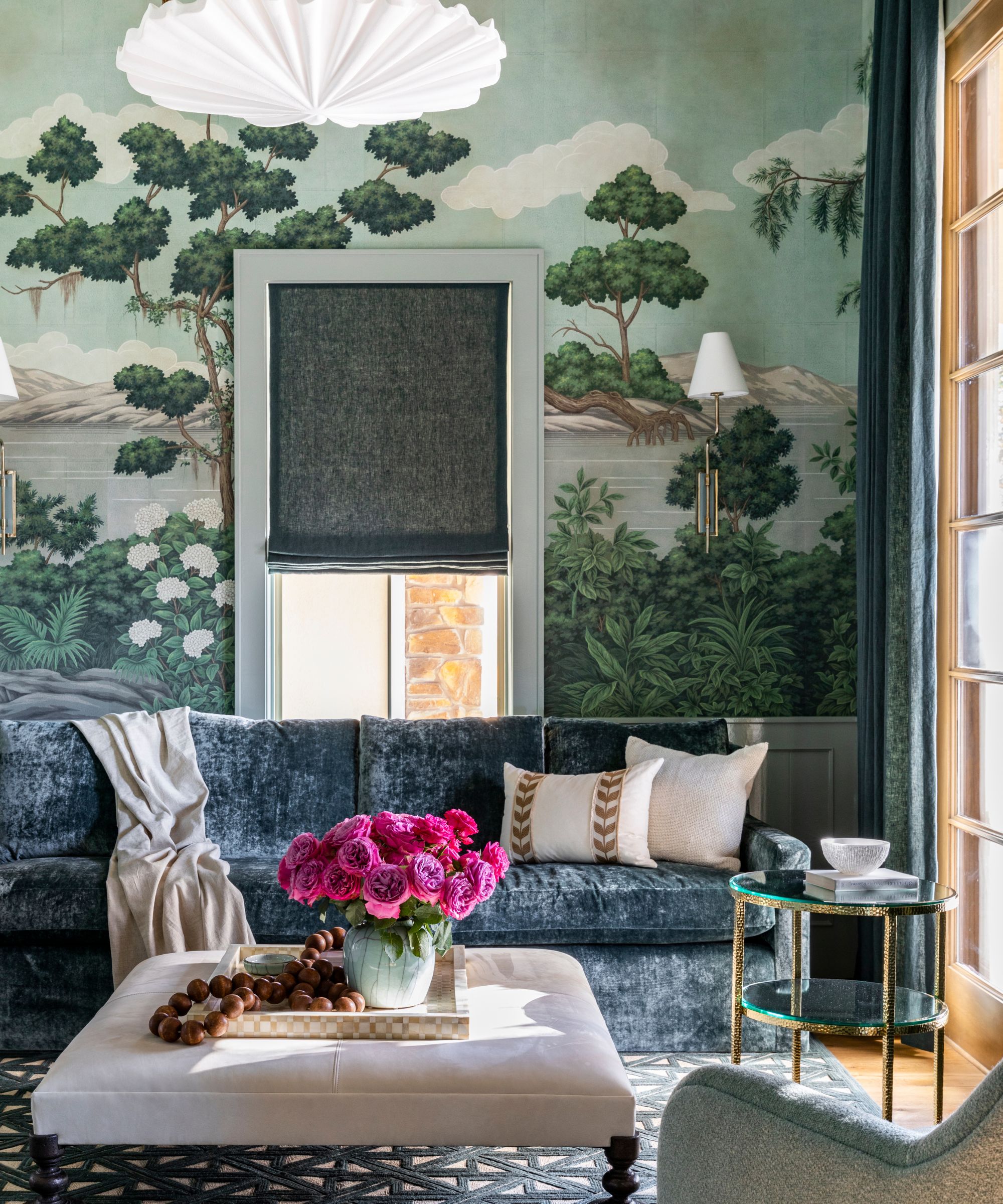
Supporting Data and Market Insights
The movement away from neutral-dominated spaces is backed by major industry players who monitor consumer buying habits and home renovation trends.
According to Helen Shaw, Director of Marketing at Benjamin Moore, consumer demand has shifted decisively toward heavier, more dramatic pigments:
"Rich, deep tones are increasingly popular with consumers, with shades like royal blue, plum, and emerald green seeing a surge in demand," explains Shaw. "Evoking the grandeur of the Renaissance, this color trend is making a dramatic return to our homes, infusing interiors with luxury and sophistication."
Design psychologists note that saturated colors engage the human eye differently than soft pastels or neutrals. Because jewel tones possess high pigment concentration, they absorb and reflect light in ways that add dynamic warmth to a room. When placed against a stark black-and-white framework, these colors do not clash; instead, they are optically stabilized by the neutral backdrop.
Official Industry Responses and Expert Perspectives
Interior designers and color specialists agree that the beauty of the black-and-white-plus-jewel-tones trend lies in its accessibility. You do not need to gut-reno your living room or repaint your entire house to achieve the look.
The Low-Commitment Approach
Design experts emphasize that incorporating this trend can be as simple as swapping out soft furnishings and decorative accessories.
- Textiles: Adding velvet throw pillows in shades of deep teal or ruby red introduces tactile warmth.
- Art and Glassware: Placing hand-blown, colored glass objects (such as sculptural vases or tinted glassware) on open shelving or a coffee table instantly breaks up a monochromatic monotony.
- Statement Furniture: A single emerald green velvet accent chair can completely alter the energetic gravity of an otherwise stark living room.
"You don’t need to completely rethink your color scheme to embrace the trend," design commentators note. "Even a single emerald green chair or sapphire blue accent can make a surprisingly big difference."
Implications: What This Means for the Future of Home Decor
The embrace of jewel tones against a monochrome baseline signifies a broader psychological shift in how we view our living spaces.
- Personalization Over Perfection: For years, interior design trends were dictated by strict rules of minimalism and uniformity. The current wave encourages homeowners to curate spaces based on emotional resonance rather than rigid adherence to a single design rulebook.
- Longevity of Design: By anchoring a room in timeless black-and-white architectural elements, homeowners create a flexible framework. If jewel-toned accents ever fall out of favor, they can easily be swapped out for a different palette without requiring a major structural overhaul.
- The Rejection of ‘Boring’ Minimalism: While minimalism is not dead, sterile minimalism is fading fast. Modern minimalism must have soul, texture, and narrative depth—qualities that rich, historic jewel tones provide in abundance.
Shop the Look: Curated Jewel-Toned Decor
If your living space currently leans neutral and you are looking to infuse it with the warmth, richness, and celebrity-approved energy of Kourtney Kardashian’s home, consider these expert-curated pieces:
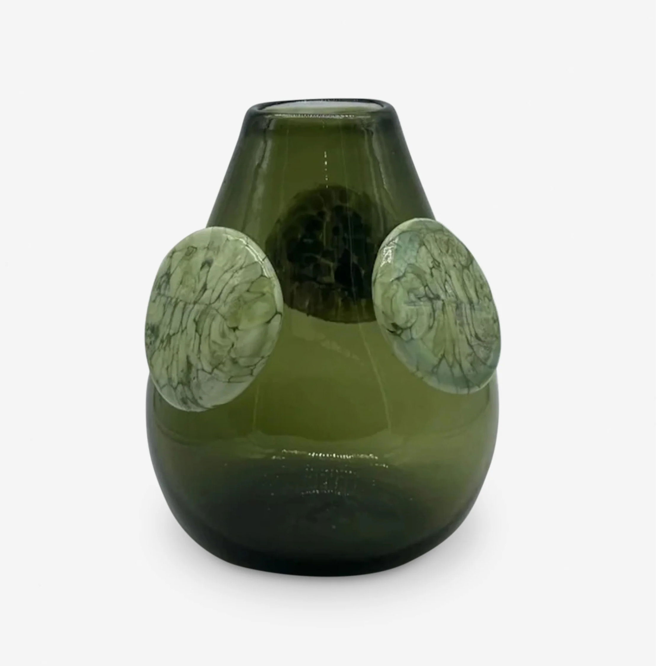
1. Lulu and Georgia: Ojo De Liebre Vase by Meso
- The Look: A dark green, highly sculptural vase crafted from recycled glass and finished with decorative discs.
- Why It Works: It brings rich color, organic texture, and a touch of theatrical drama to a console, bookshelf, or dining table without requiring a permanent color commitment.
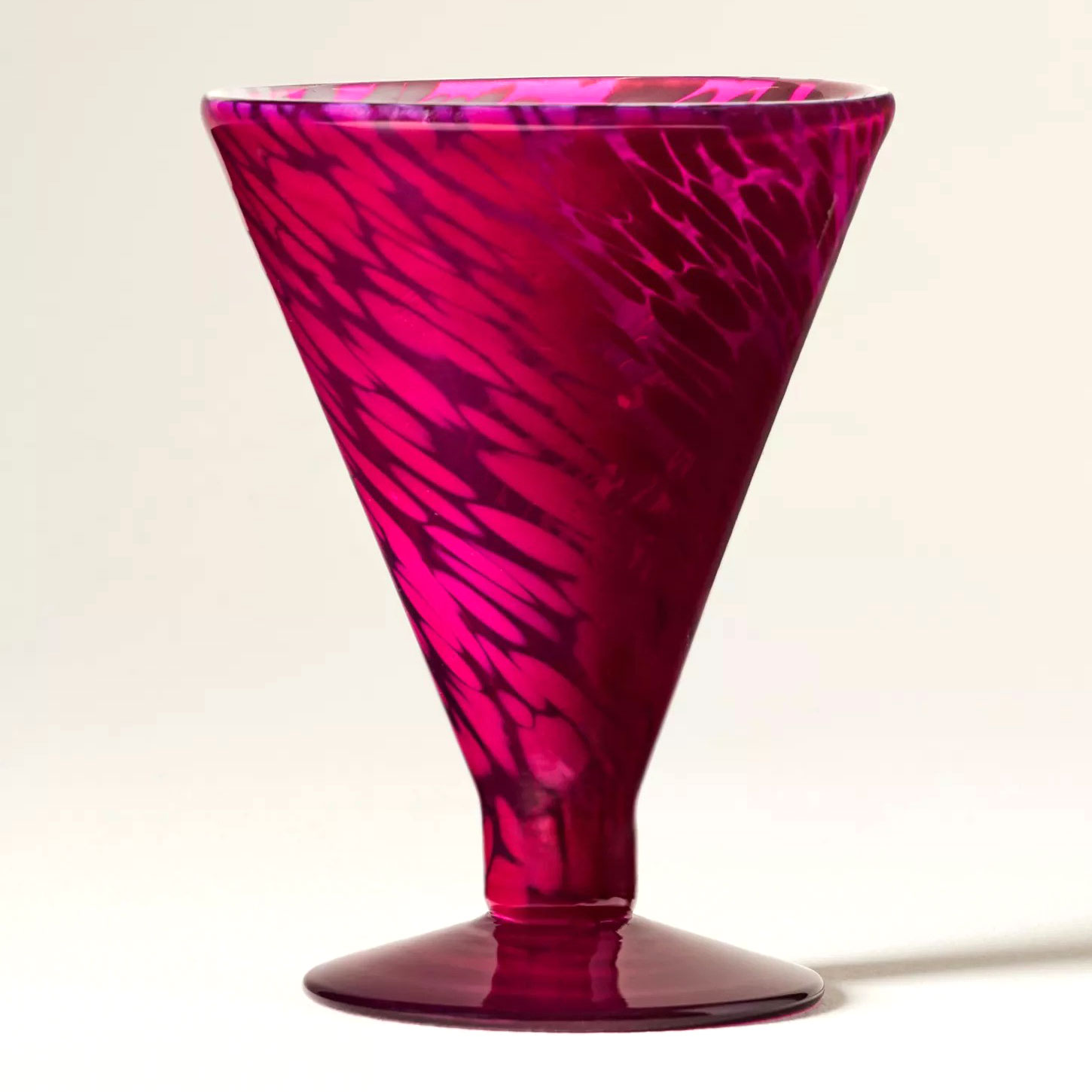
2. Anthropologie: Gia Stemless Martini Glass
- The Look: A playful, handcrafted stemless glass rendered in a bold, saturated pink hue.
- Why It Works: It introduces an unexpected pop of color to tabletops and bar carts, proving that small accessories can carry a massive visual punch.
3. Target (Threshold): Faux Mongolian Fur Throw Pillow (Dark Teal Blue)
- The Look: A plush, tactile throw pillow in a deep jewel teal.
- Why It Works: It offers an instant injection of color and luxurious texture, making it effortless to layer onto a neutral sofa or bed.
Conclusion
Kourtney Kardashian’s living room proves an enduring design truth: classic foundations do not have to mean boring execution. By marrying the crisp, architectural timelessness of black-and-white design with the passionate, historic depth of jewel tones, modern interiors can achieve a rare duality—feeling both structurally disciplined and vibrantly alive. As we move further away from the era of uniform neutrals, leaning into rich, expressive color is no longer just a design choice; it’s an extension of personal storytelling.
