As modern homeowners increasingly prioritize warmth, comfort, and lived-in charm over sterile minimalism, the reign of cold, stark gray kitchen palettes is officially drawing to a close. For years, sleek monochromatic grays dominated residential design, often leaving kitchens feeling clinical rather than welcoming. However, interior designers are quick to point out that gray itself is not the enemy—it was simply misunderstood and improperly executed.
Today, a sophisticated evolution is taking place. Paints featuring complex green and blue undertones are stepping into the spotlight, offering the best of all worlds: the timeless structure of gray paired with the organic serenity of nature. At the forefront of this design shift is Farrow & Ball’s Pigeon—a nostalgic, cozy paint color that is rapidly becoming a staple on designer sample lists worldwide.
Main Facts: Decoding the Appeal of Pigeon
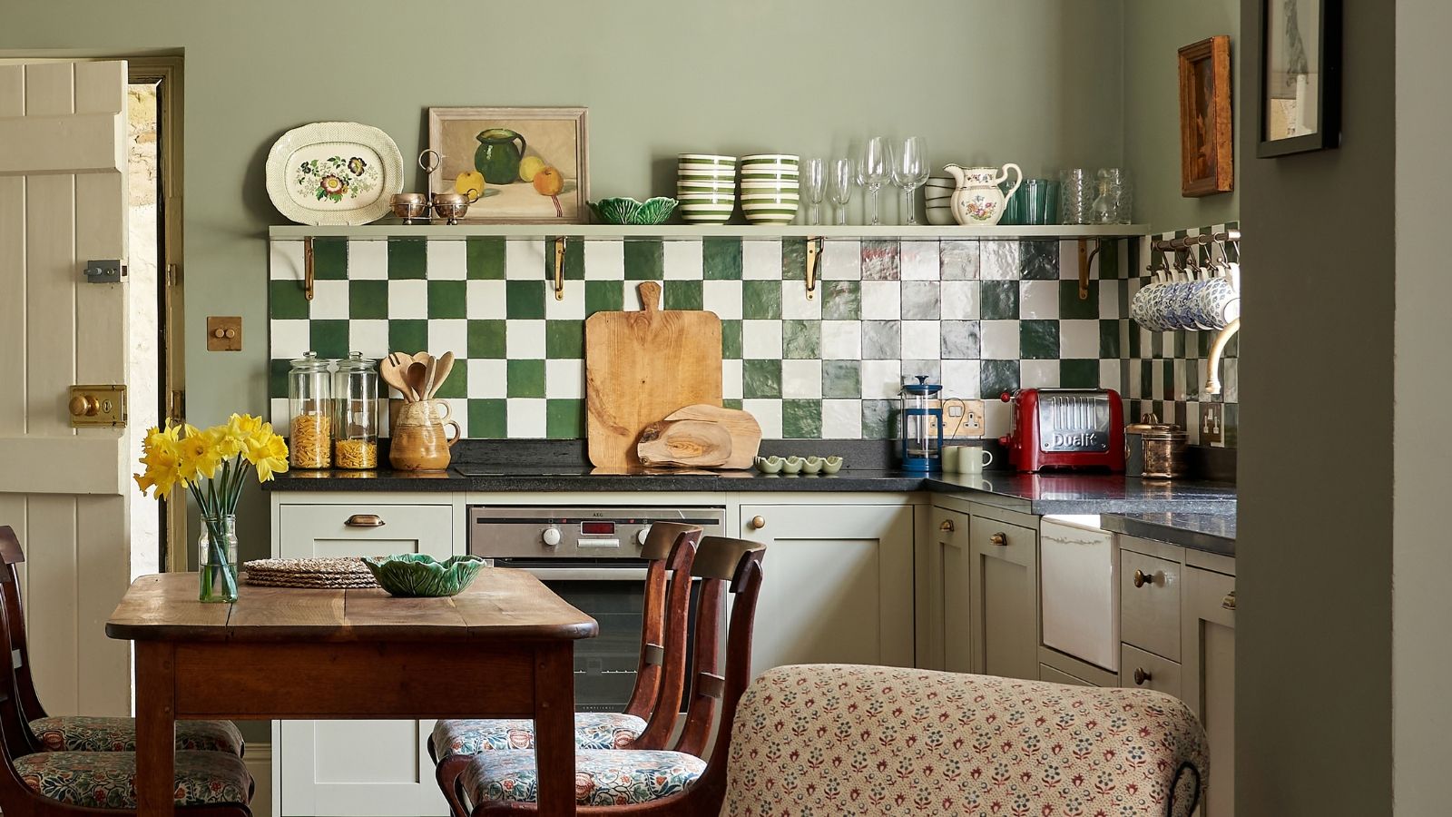
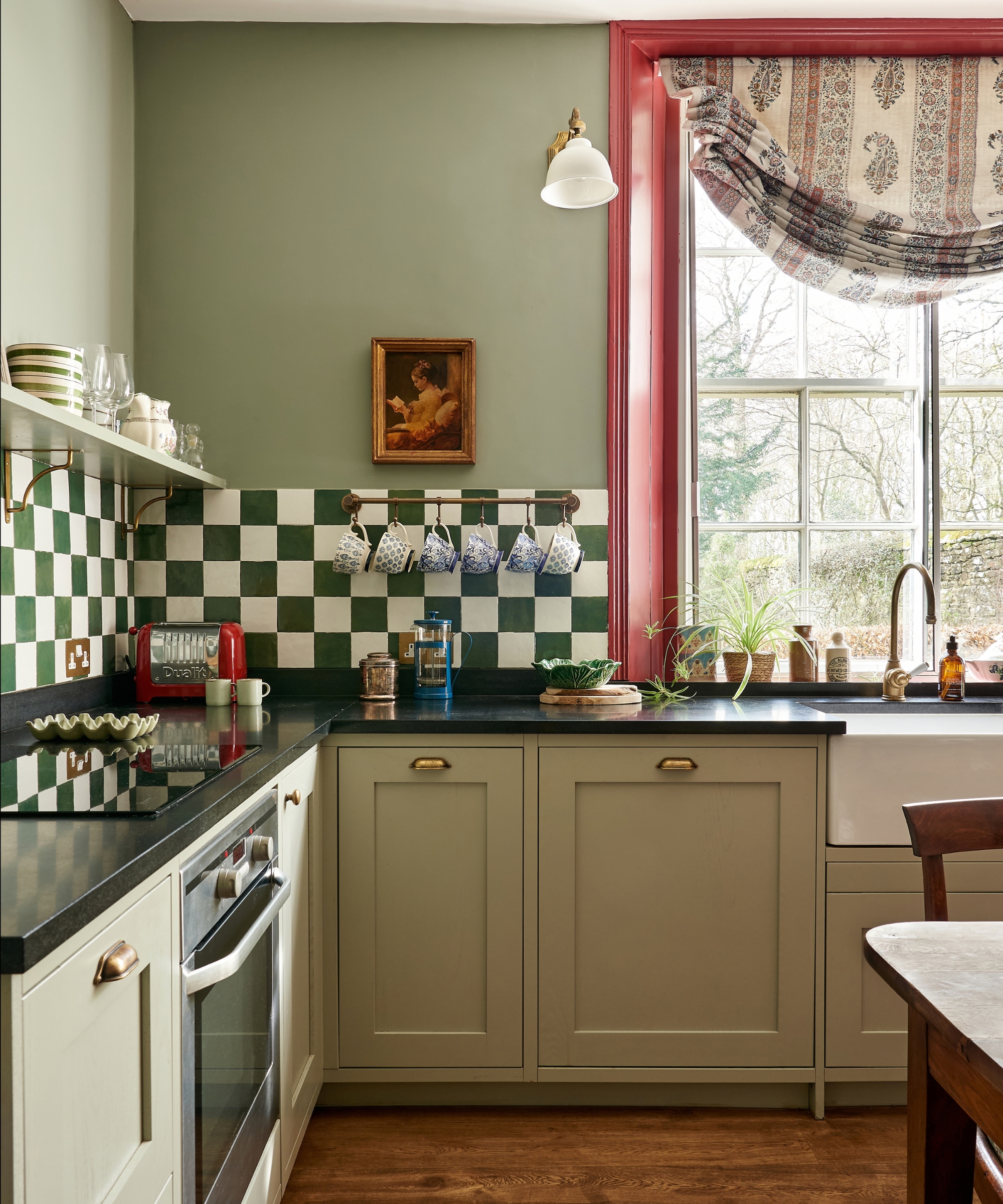
Farrow & Ball officially describes Pigeon as a strong, cozy, and nostalgic paint that bridges the gap between light coastal tones and heavy, grounding neutrals. Far from a flat, industrial gray, Pigeon is an earthy chameleon built from a rich blend of green, blue, and gray pigments.
The Chameleon Effect: Because of its heavy, complex pigmentation, Pigeon is not static. It subtly shifts its appearance depending on the time of day, the natural light flooding the room, and the artificial fixtures surrounding it.
The Nature Connection: The hue ties directly into the overarching 2026 interior design trend of bringing the outdoors inside. It offers depth and visual interest without disrupting traditional design principles.
Spatial Versatility: Whether drenched across all four walls, applied exclusively to a run of lower cabinetry, or used to accent a statement kitchen island, the color adapts seamlessly to both expansive modern floor plans and cozy country cottages.
Chronology: The Evolution from Cold Grays to Earthy Neutrals
To understand why Pigeon is having a defining moment, one must trace the timeline of kitchen color trends over the past decade:
The Mid-2010s (The Sterile Gray Era): Homeowners heavily favored stark, cool grays paired with high-gloss finishes and stark white quartz. While clean, these spaces often lacked emotional warmth.
The Early 2020s (The Great Shift to Green): As global events forced people to spend more time indoors, a collective psychological need for nature-infused spaces emerged. Sage, olive, and forest greens surged in popularity for kitchen joinery.
The Present Day (The Rise of Hybrid Hues): Realizing that pure greens could occasionally feel too vibrant or limiting, designers began searching for transitional shades. Pigeon and similar complex hybrid tones stepped in to fill the void, offering a muted middle ground that satisfies the appetite for both gray restraint and earthy warmth.
Supporting Data and Designer Insights
Top-tier interior designers are leaning heavily into this trend, citing the color’s unique capacity to dissolve the boundary between a functional workspace and a comfortable living area.
Fiona Parke of Johnston Parke Interiors
"Pigeon is a soft, earthy neutral with green, blue, and gray undertones that brings warmth to a space without making the room too dark," explains Fiona Parke of Johnston Parke Interiors. "It’s also a very calming color yet adds depth and interest. The rich pigment means that it subtly changes color throughout the day."
Parke notes that her firm frequently pairs the shade with Farrow & Ball’s School House White on walls, complemented by antique brass hardware, natural timber, and classic limestone flooring.
Emma Sims Hilditch of Sims Hilditch
"Pigeon is a wonderfully versatile color for a kitchen," says Emma Sims Hilditch, Founder and Creative Director of Sims Hilditch. "It has a softness to it that makes a space feel welcoming and relaxed, while the gray undertones give it a timeless quality. It works particularly well in kitchens because it feels understated rather than overly colorful and can sit comfortably alongside both traditional and contemporary elements."
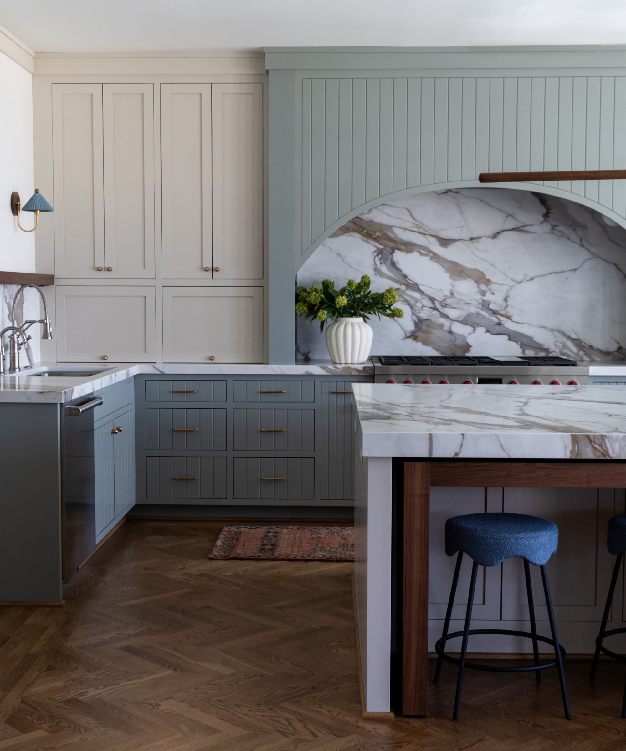
Sims Hilditch recommends pairing the color with natural stone countertops, aged bronze or brass hardware, and warm timber finishes to draw out its underlying warmth.
Taylor Bates of Elliott Tate Design
"Pigeon is an emotionally versatile color," notes Taylor Bates of Elliott Tate Design. "It can evoke a beachside paradise, add a dash of whimsy, or hold its own in a traditional environment."
Bates highlights a recent project where the firm utilized Pigeon on lower cabinets and a custom range hood, paired with rich walnut wood and earthy accents to establish a tranquil, harmonious atmosphere.
Official Responses and Styling Recommendations
While manufacturers and design houses celebrate the emotional adaptability of Pigeon, mastering its application requires a deliberate approach to lighting and material pairings.
Recommended Color Palettes
For Crisp Contrast: Pair Pigeon with light, airy whites such as School House White or Off-White by Farrow & Ball. This combination keeps small kitchens feeling open, bright, and modern.
For Moody Depth: For a more dramatic, cocooning environment, designers recommend pairing the paint with deeper, alluring hues like Picture Gallery Red or Green Smoke.
For Rustic Charm: Layering Pigeon alongside traditional cream shades like Old White on adjacent cabinetry creates an inviting country-house aesthetic, particularly when applied to wooden wall paneling.
Strategic Application Ideas
Full-Room Drenching: Applying the color to both walls and trim creates a seamless, immersive environment that makes the kitchen feel less like an industrial workstation and more like an integrated living space.
Cabinetry and Islands: Using Pigeon strictly on base cabinets or a central kitchen island grounds the room, introducing a sophisticated focal point without visually crowding the space.
Secondary Spaces: The shade performs exceptionally well in functional utility zones, walk-in pantries, and bootrooms, where its practical, muted nature hides everyday wear while maintaining high aesthetic appeal.
Implications for the Future of Kitchen Design
The widespread embrace of shades like Pigeon signals a broader philosophical shift in residential architecture and interior design. Kitchens are no longer viewed merely as clinical laboratories for food preparation; they are recognized as the emotional epicenters of the home.
As consumers move away from disposable, hyper-trendy finishes in favor of enduring, emotionally resonant palettes, paints with complex undertones offer longevity. Because Pigeon responds dynamically to changing light and shifts effortlessly alongside evolving hardware, textiles, and decor styles, it represents a sustainable investment in home styling.
Ultimately, Pigeon proves that gray is not dead—it has simply matured. By infusing cool neutral foundations with the restorative warmth of earth and sky, homeowners can achieve a kitchen space that feels simultaneously fresh, timeless, and deeply comforting.