

NEW YORK — September has long been considered the sacred month of seasonal transition within the interior design calendar. While it marks the annual turning point when homeowners swap breezy summer aesthetics for heavy, tactile layers and cozier living spaces, it also serves a far more strategic purpose. This is the month the global paint and decor industry pulls back the curtain on the future, offering a crystal-clear preview of the colors that will define our domestic lives years down the line.
If the early wave of 2027 Color of the Year announcements is any indication, the design world is firmly closing the door on the era of safe, uninspired neutrals. Bland grays, stark whites, and uninspired beige tones are officially stepping aside. In their place is a vibrant, emotionally resonant collection of hues that prove consumers are exhausted by cautious styling.
From Sherwin-Williams’ crisp, apple-inflected green to Dutch Boy’s rich, sun-baked terracotta, the paint choices revealed for 2027 speak directly to human psychology. These are colors designed to uplift, cocoon, and energize—pushing homes far away from sterile minimalism and directly into a realm of rich, intentional self-expression.
Main Facts: The 2027 Palette at a Glance
The early slate of 2027 Color of the Year selections highlights a unified departure from the status quo. Rather than relying on background neutrals to anchor a room, major paint manufacturers are positioning saturated, nature-adjacent, and emotionally charged tones as the new foundational standards.
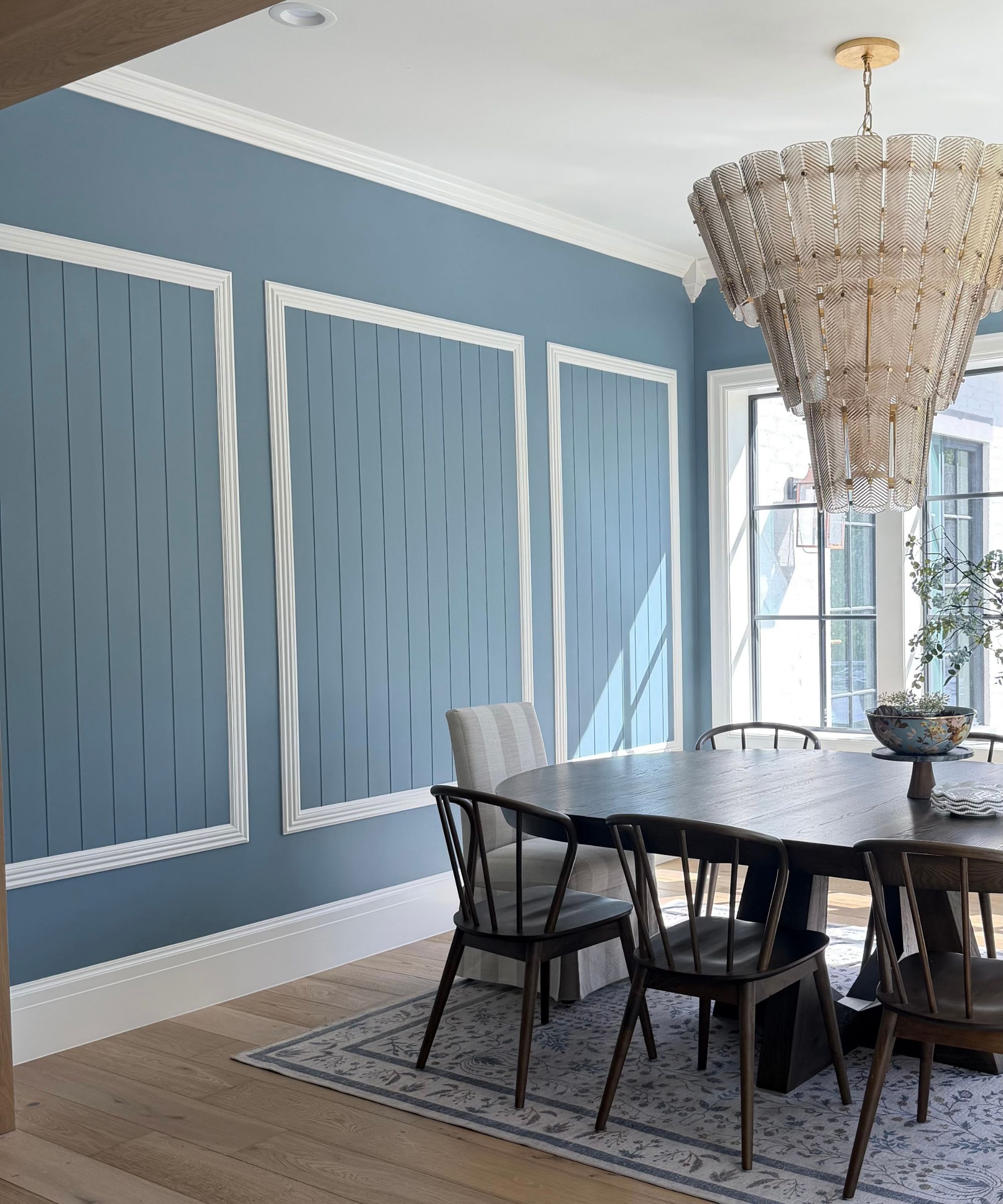
- Valspar: Cottage Door (A balanced mid-tone powder blue with subtle gray undertones).
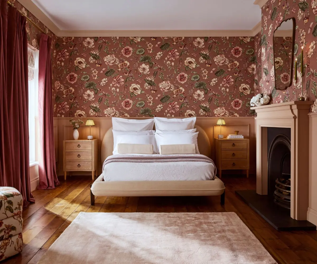
- Graham & Brown: Rose Earth (A grounding, chalky dusty pink with faded terracotta and plaster notes).
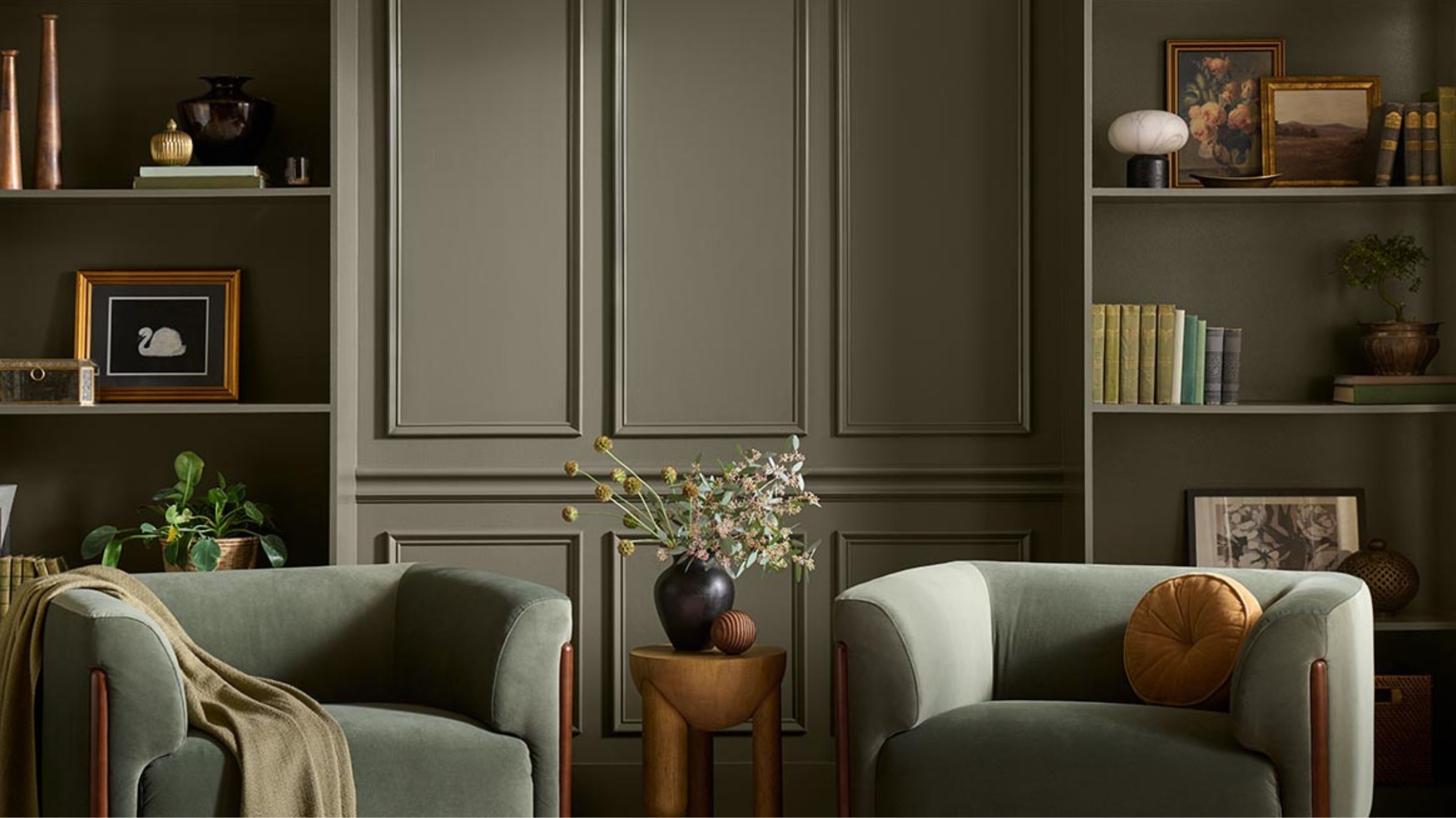
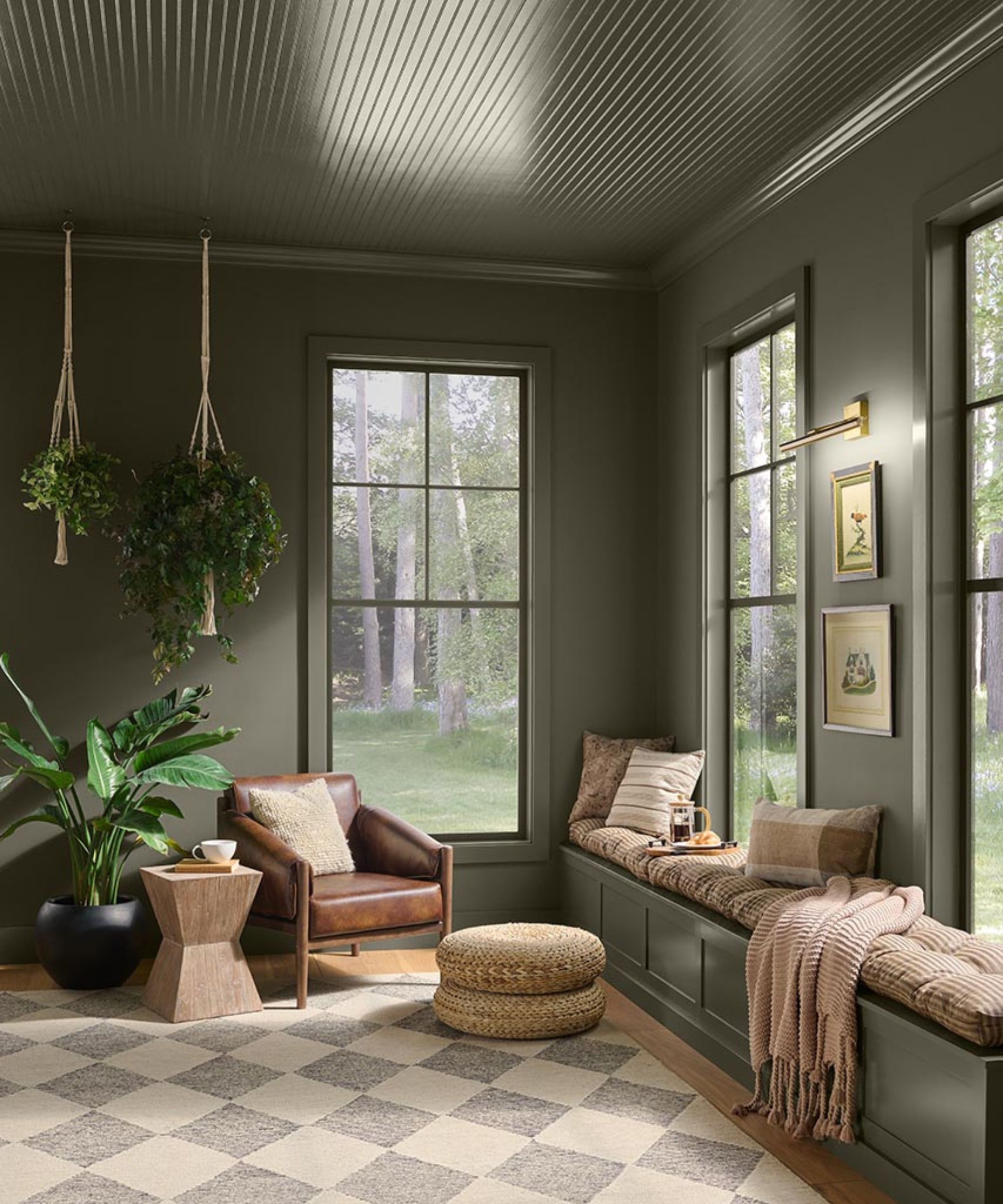
- Behr: Grounded (A moody, saturated, and luxurious mossy green).
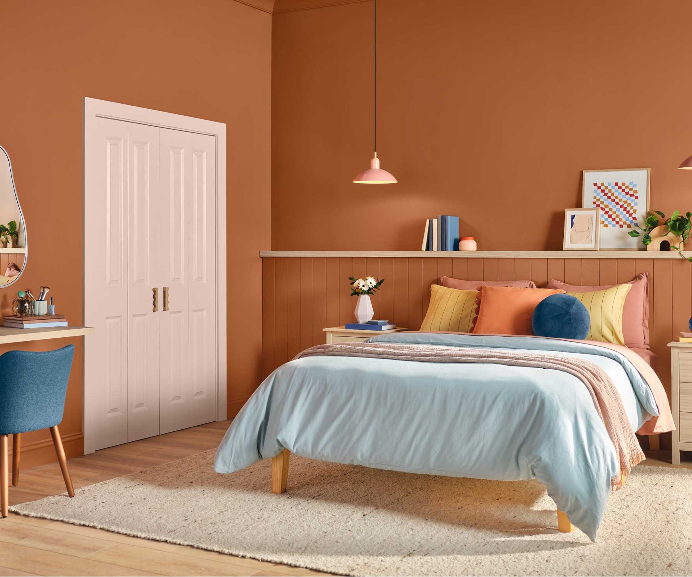
- Dutch Boy: Deep Rooted (A versatile, orange-infused mid-toned terracotta).
- Dulux: Soulful Sage (A fresh, heritage-inspired pale green with a timeless appeal).
- Sherwin-Williams: Celery (A bright, yellow-infused, zesty green that brings a crisp energy to interiors).
What unites this diverse group is an absolute rejection of the sterile environments that dominated residential design over the past decade. Instead, these market leaders are leaning heavily into organic warmth, historical resonance, and tactile comfort.
Chronology of the 2027 Color Reveals
The rollout of these anticipated shades follows a carefully orchestrated industry timeline, beginning in the late summer and stretching deep into the autumn months as major brands stake their claim on the future of home decor.
Late Summer: Setting the Stage for Change
As the interior design community gathered to evaluate upcoming macroeconomic design shifts, color strategists noted a distinct fatigue among consumers. The post-pandemic desire for absolute safety and stark, easy-to-clean aesthetics had run its course. Homeowners no longer viewed their walls as mere backdrops for furniture; they increasingly demanded that rooms actively participate in emotional well-being. This shift set the stage for brands to step away from traditional off-whites and experiment with deeper, more psychological spectrums.
Early September: The Initial Wave Drops
The formal rollout kicked off with brands releasing their flagship shades, immediately signaling a shared obsession with the natural world. Green emerged as an undisputed front-runner, appearing in multiple iterations across different manufacturers. However, unlike the deep forest greens of previous years, the 2027 selections spanned a much wider emotional range—from the crisp, youthful brightness of Sherwin-Williams’ Celery to the moody, cocooning depths of Behr’s Grounded and the heritage charm of Dulux’s Soulful Sage.
Mid-September: Expanding Beyond Green
As the month progressed, the palette broadened to include restorative earthy tones and unexpected pastels. Valspar introduced Cottage Door, redefining how consumers view blue by blending it with calming gray undertones. Simultaneously, Dutch Boy and Graham & Brown anchored the earthy end of the spectrum with Deep Rooted and Rose Earth, proving that terracotta and dusty pinks can function as modern neutrals when executed with the right amount of chalky, desaturated depth.
Supporting Data and Market Insights: Why Neutrals Are Out
To understand why brands are taking such bold risks for 2027, one must examine the shifting priorities of modern homeowners. Market data from interior design associations shows a massive surge in "emotional decorating"—a design philosophy prioritizing personal mental health, sensory grounding, and tactile richness over resale value and mass-market minimalism.
- The Rise of the "Colorful Neutral": Paint chemists and color marketers report a 40% increase in consumer demand for hues that bridge the gap between color and neutral. Shades like Graham & Brown’s Rose Earth and Valspar’s Cottage Door function psychologically like beige or taupe—offering versatility and calm—while providing significantly more visual stimulation.
- Nature-Infused Biophilia: Green remains the undisputed king of modern palettes, but its dominance is evolving. Consumer preference has pivoted away from clinical mints and heavy teals toward organic, earth-rooted variations that mimic natural foliage, moss, and agricultural yields.
- Texture and Layering: The 2027 palette is deliberately engineered to work alongside heavily textured interiors—such as unlacquered brass, boucle fabrics, dark wood, and handmade ceramics. These paint colors do not demand to be looked at in isolation; they are built to anchor layered, lived-in spaces.
Official Responses from Industry Leaders
The masterminds behind these formulations have been vocal about the psychological intentions driving their 2027 choices. Far from throwing darts at a color wheel, these brands rely on extensive sociological and trend forecasting.
Valspar: Redefining Blue
Sue Kim, Director of Color Marketing at Valspar, emphasized the personal nature of their selection, Cottage Door.

"Cottage Door celebrates the unique beauty inside us all," Kim explains. "This mid-tone neutral blue is reflective and warm, with timeless appeal that feels personal and grounding. Cottage Door captures blue’s natural sense of security and trust while serving as a colorful new neutral that layers effortlessly into the home. It creates spaces that feel balanced, comforting, and inviting."
Behr: Connecting with Everyday Life
Focusing on the heavier, more luxurious side of the spectrum, Kayla Kratz, Head of Color at Behr Paint Company, pointed to the need for sanctuary within residential spaces.
“Grounded is a reminder that the most meaningful spaces are the ones that help us connect with the rhythms of everyday life,” says Kratz. The shade is intended to wrap around a room, offering an immediate sense of decompression the moment one steps inside.
Dutch Boy: Human Warmth and Versatility
Lisbeth Parada, Color Marketing Manager at Dutch Boy Paints, highlighted the life and energy embedded within their terracotta selection, Deep Rooted.
“Our 2027 Color of the Year feels alive with possibility while being rooted in the familiar warmth of nature," notes Parada. "Deep Rooted offers a color that feels rich, grounding, and deeply human. Its earthy orange tone creates a versatile foundation for spaces that celebrate individuality through bold contrasts and layered textures.”
Sherwin-Williams: The Evolution of Nature
Addressing the surprising vibrancy of their pick, Ashley Banbury, Color Marketing Manager at Sherwin-Williams, noted that our relationship with the great outdoors is shifting.
“Celery shows that our connection to nature isn’t going away, but the way we’re interpreting nature-inspired color is evolving," says Banbury. "We’re moving toward hues that still provide a sense of comfort and restoration but also bring more freshness, lightness, and personality into the home. Rather than creating spaces that feel overly styled or perfect, there’s an emphasis on interiors that feel welcoming, layered, and reflective of everyday life.”
Implications for Interior Design and Homeowners
The widespread alignment among paint manufacturers on these non-neutral, emotionally driven palettes carries profound implications for the future of residential real estate, home renovation, and interior styling.
1. The End of the "Flip-Ready" Gray Box
For over a decade, real estate developers and home flippers relied on uniform gray walls and stark white trim to appeal to the widest possible demographic. The 2027 trend forecast signals the absolute death of this practice. Homebuyers are increasingly rejecting soulless, cookie-cutter interiors in favor of homes with established character, rich color palettes, and distinct personalities.
2. A Shift Toward Intentional Decorating
When a homeowner paints a room in a saturated moss green like Behr’s Grounded or an energetic apple-green like Sherwin-Williams’ Celery, design decisions must become more deliberate. These colors dictate furniture placement, lighting choices, and textile pairing. Consequently, the industry is seeing a major upswing in artisanal craftsmanship, vintage sourcing, and bespoke furniture design as people curate spaces that match the weight of their walls.
3. Mental Health as a Core Design Metric
Perhaps the most significant implication of the 2027 color landscape is the mainstreaming of wellness architecture. The home is no longer viewed merely as a functional shelter or a status symbol; it is an active psychological sanctuary. Whether a consumer seeks the soothing calm of Valspar’s powder-blue Cottage Door or the cocooning, restorative embrace of Dulux’s Soulful Sage, paint is officially being prescribed as a tool for emotional regulation.
As the remaining paint brands release their predictions over the coming weeks, one reality remains crystal clear: the era of playing it safe on your walls is over. The future belongs to color that feels, breathes, and tells a story.
